@phoenixdk @Neohex @thesnesmaster @acolyte @abc3dz @amarc @conz3d @BrutalDevon
Wishlist!! Thanks!!
@phoenixdk @Neohex @thesnesmaster @acolyte @abc3dz @amarc @conz3d @BrutalDevon
Wishlist!! Thanks!!
Regarding visuals. Do something to make the game look less like a spreadsheet.
As someone already suggested, it seems like themed graphics would help that. On the second thought, the nature of the game is very abstract and numbers oriented. It looks like a sort of thing that may appeal to sudoku people. So I think keeping the visuals more on the abstract side would actually be the best.
However, it’d be nice to have some additional visual feedback that makes (relative) strengths of cells apparent at a first glance, without needing to read the numbers. That way, overseeing the situation on the board would be much less tedious.
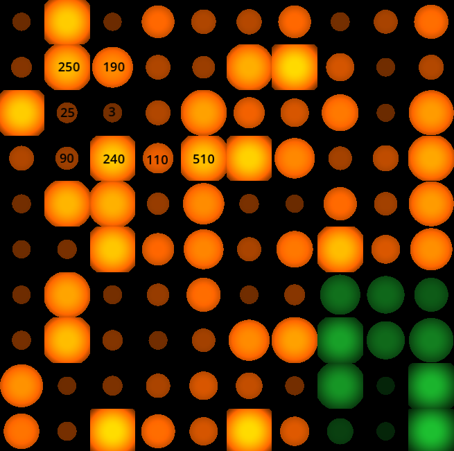
Why not employ some kind of a “heatmap” view, where, in addition to numbers, cell size and/or brightness signify its strength. You can use the whole cell estate, without any margins or borders. The scaling could be logarithmic as your numbers can get quite large. Something like this:
Ok, but I’ve already done this game
Nothing is stopping you from making/releasing updates that improve it.
My friend, but I really like my game and I’m very satisfied with it. I don’t think I would change anything about it ; ]
Do your beta testers share your opinion?
It doesn’t matter. I made a game that I like and that I think is cool. I’m not going to make games based on other people’s opinions. You know people have different tastes, right? Some people have shitty taste, while others have great taste.
I see, sorry to intrude. Although this is more a matter of visual functionality, not taste. It’s objectively measurable metric.
No problem, really. I just make games based on my own vision, not on how someone else sees them or wants my game to look. Criticism and advice are obviously good, but in my case, they won’t change how my game looks because I don’t make games for money 
Again, it’s not about the looks. It’s about playability. You took my suggestion
too literally. I’m not suggesting the look. The image was just a quick “sketch”. I’m suggesting to use additional visual design elements to better convey crucial gameplay information to the player. The actual aesthetics of it can vary greatly. You can design it according to your taste and overall art direction of your game. The gist is to provide more immediate/primal/obvious visual communication in addition to numbers. How specifically would it look - it’s up to you.
Even if you don’t make games “for money” you still want people to enjoy playing them, don’t you? So you need to think about player experience. Otherwise, what’s the point of designing a game and putting it out on a marketplace like Steam?
In your game, the player needs to constantly scan a large grid of numbers that go up to 4 digits, just to asses the situation. It imposes a persistent but rewardless mental/perceptual tax. Why not reduce that friction by employing some visual design theory. Provide more impactful visual feedback to the player to make their playing experience better. Orchestrate multiple means that convey the key information to make sure it comes across easily. It’ll also broaden your potential audience, as people have different visual perception affinities. Some may prioritize numbers but others may prefer “shape language”…
And no need to get defensive about feedback that sounds challenging. Be grateful that you get it. Let it simmer. It may yet prove to have some merit and usefulness down the line.
It’s not necessarily the way you say it is. For example, if the squares were smaller, the numbers wouldn’t fit—there could be a number like 11,000 on a single square.
You haven’t played the game yet, so you can’t be 100% sure that what you’re saying is correct. Of course, everyone has their own vision of the games they play, and that’s okay. Some developers listen to suggestions, while others don’t. The developer makes the game, not the player.
The demo will be available soon, and if you decide to play it, you’ll be able to say more afterward.
It’s also not always possible to improve certain things, because sometimes there simply is no better solution. I also tried to solve many problems related to how the game should look and work, and the result is what you can see now.
Besides, I’m happy with my game, and I prefer my own vision over the vision of people I don’t know. I put the game on Steam to earn a few hundred or a few thousand dollars, not millions.
Yes I can because I have some experience in art directing turn based strategy titles.
But I won’t press further as you seem hellbent to keep it as it is. Let’s wait and see how the demo goes.
I’ll just mention one more practical thing. Regardless of your aim to make it visually work, your design doesn’t even ensure the basic legibility of the numbers. When a textual information is presented we typically want a strong enough text vs background tonal contrast. By putting high contrast gradients behind the text, the lighter gradient color eats up part of the text, making your essential information hard to read. This becomes more apparent to the untrained eye when you turn it into grayscale:

The first 1 is on the edge of visibility. Repeat that several hundred times in a grid and you get something that’s very strenuous to the eye, and consequently to the gameplay.
I’m engaging here only because I think the game has potential but its visual presentation could be greatly improved. Again, I’m talking visual functionality, not aesthetics. I wouldn’t want to interfere with your aesthetical vision. There’s a noticeable effort to polish it but you missed some of the very fundamentals of functional visual design.
I’ve played the game many times and haven’t noticed any major problems, including the ones you mentioned. Maybe that’s because it’s my game, or maybe the things you’re talking about simply aren’t that big of an issue.
I’m not sure if I’m expressing this correctly, but I don’t think it’s possible to make everything perfect in a game. There will always be some imperfections, and sometimes they are difficult to fix or simply impossible to get rid of.
In any case, I hope someone buys my game and enjoys playing it. I’m planning to price it at $2.99, so it won’t be expensive, and people will also be able to try the demo before buying it.
Yeah, that’s because you’re very habituated to everything in the game due to prolonged exposure to it. It’s easy to develop blind spots when you spend long time with what you developed. It’s a common pitfall. That’s why it’s important to bring in more sets of fresh eyes and listen to what they think. So get that demo out as soon as possible and try to be receptive to feedback.
Btw you can run public or on-invite beta testing on Steam. I’d suggest doing that before formally releasing it.
That may well be true, but if a player approaches the game expecting it to be simple, wants to understand everything immediately, and expects everything to work exactly the way they want while playing, then my game probably won’t be like that.
You need to read the Rules section, learn how the game works, and get used to it. After spending some time with it, you may find that it’s actually a fun game.
The demo will be available in a few days or weeks.
If you don’t mind me chiming in. I believe a significant amount of people also has a form of colour blindness. Would be nice to gather some feedback from them as well.
There’s none so blind as those that won’t see. 
Yeah, color blind people will have hard time with the game’s gui, assuming the tile colors have an important gameplay role. I didn’t want to mention that on top of what I’ve already written to not overwhelm the OP with too much criticism.
There appears to be at least 7 different colors that require discerning. They’re also in dense gradients towards black which additionally muffles their pure chromaticity making them even harder to tell apart. Those gradients also waste almost all of the luminosity (lightness) bandwidth that could have been used to signify cell strength as a “heatmap” I suggested earlier.
In general, depending solely on color-coding to present important gameplay information is not a good approach. You can get away with it if there are only 2 colors (e.g. two sides in a war) and the overall color script of the game allows for aesthetically pleasing customization of those two colors for all types of color blindness.
With three colors, things get more confusing, and anything beyond that may becomes a problem even for people who are not color blind.
So always use other means for clasifying information, in addition to color, or better said - preceding color. Typically the best is shape-coding, but texture-coding and animation-coding (for lack of better terms) may also work well. In fact the more different types of visual discernment you have - the better. Those have to work in the absence of chromaticity, i.e. only in the luminosity dimension. And chromaticity is best reserved mostly for emotional impact of the whole game screen.
Case in point - look at any match 3 game. They never rely solely on color coding the tiles. There’s always a distinct shape associated with a specific color.
A good practical check is converting your game screen into grayscale. If all relevant information reads well and the game can be played without problems - you have a good visual design (again, in terms of functionality. I won’t go into aesthetics here)
There’s this old wisdom circulating among painters: Color (chromaticity) gets all the credit, while value (luminosity) does all the work.
I don’t think there’s any problem — people with color blindness simply won’t play my game.