I tried to take a month off the project and ended up taking 2 instead… and starting another small game… anyways, I’m back at it with a clear head and some much needed energy!
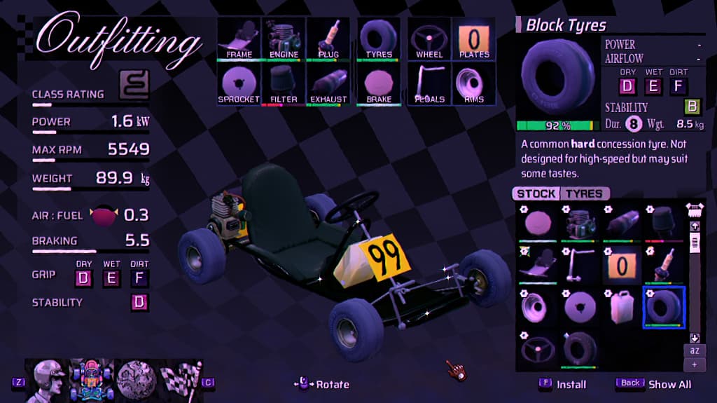
Outfitting and part stats in general have been simplified. I hid the engine performance graph from the main display - now it’s only visible when inspecting the engine itself. Brake power and Durability is shown to the player in a range of 0-10, with durability getting a distinct badge so it’s easy to recognize when buying new parts.
(You can see the old version in my earlier posts)
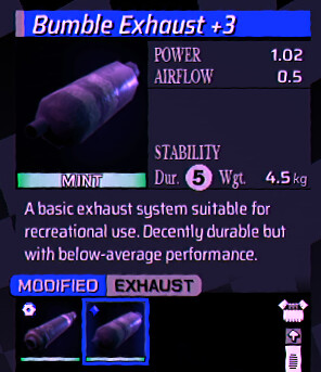
Upgraded parts now also have a distinct blue to them and a “Modified” tag so you’re less likely to accidentally scrap them.
Now health bars have a more vibrant green and deep red when below 50%. There is also a faint notch at 10% to show how close the part is to breaking. These colours now match the stat comparison colours, why they didn’t before I cannot tell you.
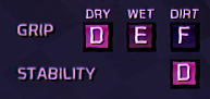
I made the part alpha ratings simpler. I removed S ratings because they were confusing, and moved the ranges to be A through F. The shiny look to them has also been reduced so they are easier to read.
The most important change is that I brought kart classes into the game. I needed them to stand out as they are used on many different screens and are important for understanding opponent levels and event limits. I was inspired by the R in the Toyota TRD logo being a road so I made all the class icons based on this concept.
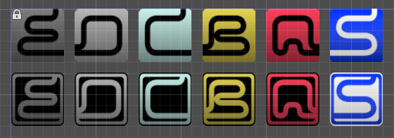
I’m really happy with how they turned out and how different they look from the other letter ratings in the game. I really tried to avoid using classes as I wanted to use CC ranges like most other kart racers but it just doesn’t make sense to base classes on engine displacement instead of overall performance.
That’s all for now. I hope this look at some of my UI decisions is useful or interesting!