Hello,
I am creating a main character for my next project, John Space. And I am wondering which version would be the most fun to play for a fun sci-fi action game?

Please vote a letter and maybe give a reason why it is your favorite?
Thanks!
Hello,
I am creating a main character for my next project, John Space. And I am wondering which version would be the most fun to play for a fun sci-fi action game?
Please vote a letter and maybe give a reason why it is your favorite?
Thanks!
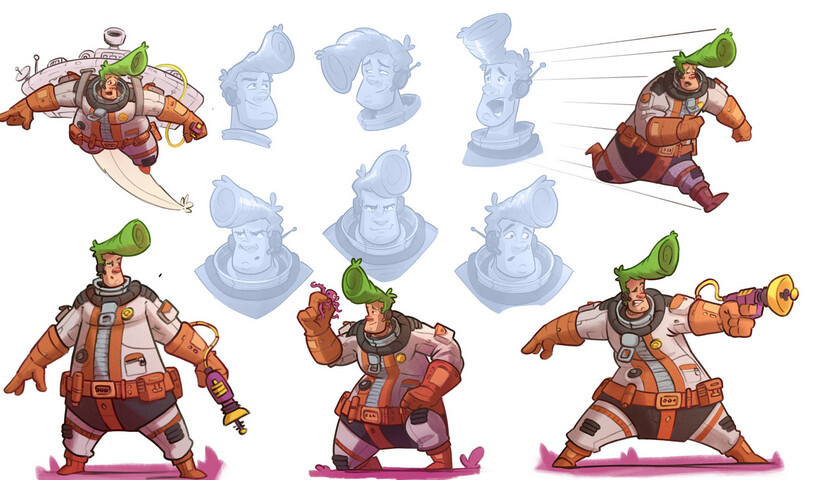
Based purely on appeal, H is my favorite. The green pompadour and bright orange highlights make me think this game is more ‘Spaceballs’ than ‘Star Trek’, and H’s proportions are cartooniest. All characters are wide at the hips, but in the case of H, this is the most pronounced.
Thank you for you reply!
It is a stylised game but the hero is not meant to look ridiculous and goofy, which makes H my least favorite ![]() at the moment! I included it because it was the original version, which I created variants from.
at the moment! I included it because it was the original version, which I created variants from.
It needs to look fun but still able to move around in an athletic way.
I don’t think H looks goofy, simply the most cartoony. It’s definitely meant to be a compliment.
If it helps, A through D all look equally muscular to me, and G looks the most muscular. I should add that the first four are more buff in the ‘hits the gym twice a week’ kind of way, and G more in a ‘spent the past five years laying brick roads and chopping trees in Northern Alaska’ kind of way.
Thank you for the feedback! Still working on it!
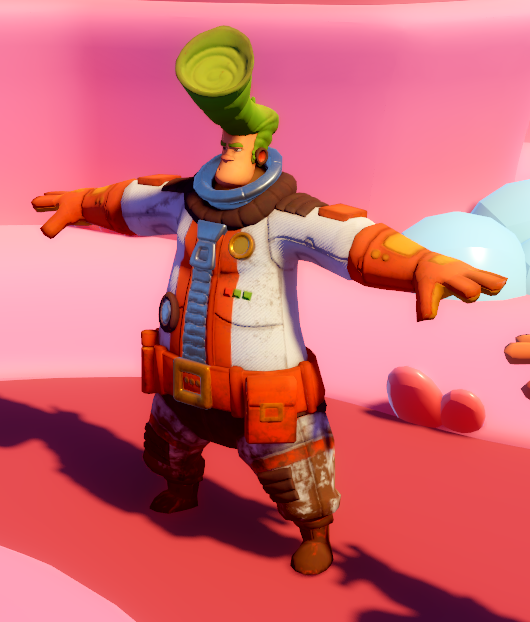
Small surprise for you
Your character in full 3d !!
Import in Mixamo and get running ![]()
I like this design a lot, but it does lead me to expect a bit of zaniness or quirkyness from the game. It sounds like that might not be what you were going for though - are there some games or shows that capture the vibe you’re hoping to hit?
I think because the variations between these designs are quite small, I’m finding it difficult to prefer any one over the others. What are the main attributes and personality traits you want to capture? Maybe you’d benefit from loosely sketching designs with wild changes made to them (rather than small ones) if you’re still not sure of the direction you want to go in.
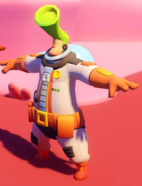
Thanks! did you model it yourself?? is it a sculpt?
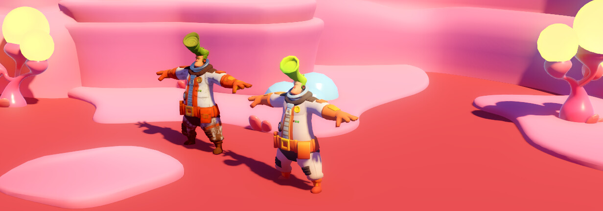
Here are my recent progress. I have been exploring two different workflows/styles.
The first workflow is sculpt in high-poly, retopology, and then bake the details into a low-poly and texture with subtance painter.
The second worklflow is low-poly + gradient textures.
Maybe not exactly comparable at the moment because of the color difference though.
yes the character is a little bit comical/fun.
He is based on a comics character I created a couple of years ago.
For the video game version, I would like to be a little bit more serious, but still very exagerated action. I wanted to hit something close to Ratchet and Clank.
But the workflow high-poly to low-poly and PBR texture is quite time consuming so I tried a low-poly + gradient texture workflow (see above).
Also, it is meant to be a topdown camera (i.e. Baldur’s Gate, Divinity Original Sins), so the model are seen from relatively far.
I cannot get enough of this character design. Phonemical work.
Edit: Let me be a bit more specific. I enjoy how expressive he his. I can instantly tell that he is serious, but also pretty goofy/clumsy. At least that’s the feel I get from this concept art.
I also enjoy the stylized proportions. That’s just my taste. And the color palette is great for a top-down game, as his hair stands out from the rest of his outfit.
What do you draw this stuff with, curious.
lets you convert 2d images to 3d, or text to 3d. handy for all kinds of models.
I decimate all the models in Blender down because of the poly count.
yes the character is a little bit comical/fun.
He is based on a comics character I created a couple of years ago.
Well in that case I think you’re nailing it. The comic is nicely done too, quite some punch there in the epilogue.
How does each method look from the perspective you expect the game to be viewed in? Perhaps most assets can be produced with the less time-costly method, and certain assets can have higher detail versions for cutscenes and the like. They would need to look alike from a distance though, or the visual shift might be jarring.
More importantly, will the game have pizza?
Haha, no pizza, John Space is more into Nachos ![]()
Thank you for reading the comics, very glad you enjoyed it!
I have been thinking about all the points you mentioned too. Looking at the character from a top-down “isometric” point of view, on different screen sizes.
My targets are:
It is very impressive how much we don’t see much on a Nintendo Switch screen!
I was thinking to always have the same camera distance during the game. But if I go for the high-to-low poly workflow, I will want to show off my efforts even on small screens ![]() so I would have 3 distances/angles:
so I would have 3 distances/angles:
So to come back to your suggestion, I’ll probably try to have environment assets that are less detailed/time-costly, and hope that I get more efficient at sculpting my characters!
Thank you very much, your feedback means a lot to me!
What you describe is exactly what I wanted to convey, and I hope I will succeed to keep this balance of goofyness and seriousness in the game.
The concept arts are drawn in Procreate on iPad, and the comics are done in Clip Studio on iPad.