"Chromatic Crisis" - Looking for feedback! Solo Metroidvania

,

thank you very much and im really glad you liked it :))

1 Like

tried something different with world 1’s soundtrack https://youtu.be/BrsZdmUQ1Ic hope its better now :face_in_clouds:

2 Likes

Nice :slight_smile:

The first section gets a little unnecessarily long and big in my opinion, it’s kind of a 50 second intro for a 2 minute song… I’d cut it in half and go easy on the layering. Still nice to have a drop in intensity when it loops though, it’s kind of all you notice as a player.

1 Like

thank you very much!!

1 Like

I (almost) fixed everything you pointed out to me in the meantime— thx everyone for your advice

The only things I haven’t

fixed yet are:

- anything related to the default controller button assignments (since I can’t really test that right now)

- the request about changing monitors (because when I reread it, I didn’t really understand lol, sorry)

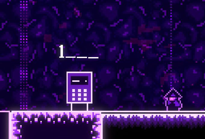
also here’s a screenshot from another world :

3 Likes

Looks excellent! Looking forward to getting further in the game with the next build :slight_smile:

1 Like

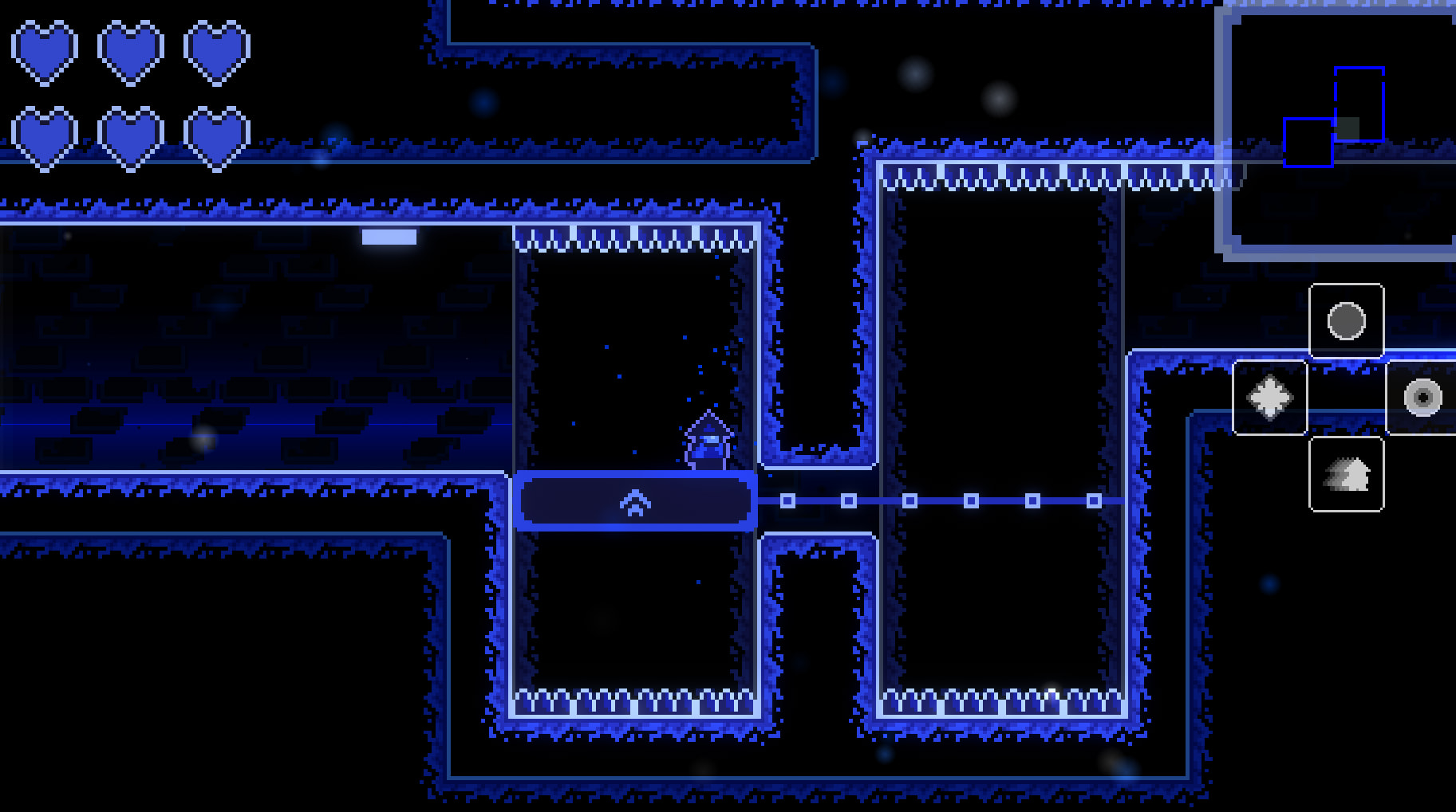
4 different types of attacks done

That being said I feel like the default attack (kind of like Hollow Knight’s sting) just isn’t as fun to use compared to the others so I’m thinking about removing it…

2 Likes

Just growing out of it is valid too, I’d say… but if you want it stay relevant to the player, maybe it could be upgraded later? A short-range, high-damage attack might be interesting, forcing the player to get close to enemies (where the other three add range).

1 Like

I totally get what you’re saying and honestly that might be a good idea too, but I also feel like using the basic attack just isn’t as fun as using projectiles—not to mention their power. I kind of feel like attacking with projectiles has a better ā€œgame feelā€ to it idk why..

might be wrong idk

1 Like

What do you feel like it’s lacking, in terms of fun? I’m thinking it could feel slower / less immediate, because of the time to position oneself compared to just firing. It’s also riskier, which can make it a little nerve-wracking, and not necessarily in the good way.

1 Like

('Sry for late reply)

What do you feel like it’s lacking, in terms of fun?

Actually, I feel like it encourages you to stay still, whereas other weapons allow for more movement—though maybe I’m wrong…

That said,

I’m thinking it could feel slower / less immediate, because of the time to position oneself compared to just firing. It’s also riskier, which can make it a little nerve-wracking, and not necessarily in the good way.

thanks for the advice; it might actually work better :slight_smile:

1 Like

Pretty cool game demo.
I got a bit lost at the start. The keybinds text at the very beginning made me expect more keybind text, so i jumped over the slime (i didn’t know i could slash it) and got stuck trying to walk around the spike gap (i didn’t know i could dash through it).
The dash mechanic is awesome. There’s inertia so it doesn’t feel like teleporting, but there’s just enough of it so that it doesn’t feel sluggish or heavy. The floor is made of floor and this dash is definitely a dash.
The looks of the game give off an ethereal vibe, the sensation of a dark world with a few small shiny things. I like this artistic side of the game, i think there’s an opportunity to captivate the hearts of your players with this aspect.
The trailer exposes the game’s personality right away. The demo… not so much. Demos don’t usually start at the actual beginning because the slow pacing of a full game’s introduction takes time. There’s a timespan of precious 5 minutes where a player decides if they wishlist this one or walk away, so bring out all your bells, whistles and explosions right at the beginning to give them a taste.

2 Likes

Thank you very much and im very glad you liked it ! In the meantime, I added a note about the attack key

And that’s a good point you made about the demo. I get the feeling that for this project it might be too late to change that lol since I think it would mean cutting some content i guess (I might be wrong lol). In any case I’ll keep that in mind if I ever work on another project :))

and thanks again its really motivating!

It looks fun, not big on platformers but with enough polish I think it can attract attention.

I would suggest you to create bit more contrast, lower the bloom a bit. There is a technique for oil painters where they narrow their eyes and try to see the details. Currently hyper bloom eats the details of design and character dissappears.

1 Like

thanks a lot ! maybe i could add an option to adjust the intensity of the glow?

tried to improve the visuals on this world

2 Likes

Yes, definitely the main character gets my attention and is easier to find on the game screen compared to the older iteration. It is generally good to find your character more easily in-game, especially if attention switches to detecting the game world.

For the setting, the bloom is pretty much comparable to the emissive color of the rest of the tiles or objects. In 3D, when you have lighting, it’s called bloom/emissiveness, my mistake. But I think the last shot is quite good since with the narrow-eye technique I can see the bricks of the tiles.

As a small improvement, if you want to experiment: the character outline offers good visibility, but again same issue as the old iteration, the contrast difference kind of eats the character details. Maybe something closer to matching the character outline’s emissiveness to the character’s line details would offer more individuality in the character details.

Again I need to point out these are my personal opnion, this is game art so perhaps your visibility was intended style so I don’t want to ruin your uniquness with general design choices!

1 Like

Looks great! I like the parallax layers, and that there is a strong color theme for each area. The environment is very readable.

For the record, I don’t have any problems with the amount of glow, and certainly not on the character. I’ll agree that the details on the avatar are very low-contrast, but the glowing outline doesn’t affect that.

1 Like

Thanks for your feedback and for sharing this technique—it’ll definitely be useful! Tbh since the pixel art here is low-resolution, I don’t get the feeling that the glow is Ā« eating up the details Ā» here but I might try adding a slider so you could reduce it—thanks again! (Btw there is an option to disable the glow (it was originally included mainly for performance reasons)

Thank you very much phoenix glad you like it! might change the background so the bricks look like they’re farther away but the idea is here!

1 Like