Hi, I’m looking for some feedback. I’m trying to create some tilesets and I would like to know if you like it
Thank you for your time!
Hi, I’m looking for some feedback. I’m trying to create some tilesets and I would like to know if you like it
I’m not in a position to critique, but I like it. Very pleasing!
Nice work! ![]()
Short(ish) answer:
Yes I do! It has a light and open tone, the linework isn’t busy, and it all looks playful and a little toylike. I expect something fairly lighthearted and fun, not at all gritty or grimdark.
I like the water texture, but want it to be animated (as I imagine is the plan anyway).
Key objects stand out from the background, even in greyscale (I did look at it in greyscale) and the bright areas of bolder colours draw attention to them and the path.
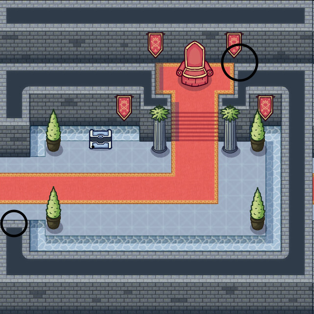
It might be worth experimenting with the objects’ shadows a bit more to gain more separation in some places - eg. the pillars blend into the wall a little to my eye, the throne could use a shadow behind it to set it apart from the wall, and the chest from the water. Judging by the highlights on the pot plants and pillars, the lighting seems to be shining from left to right, and from the camera into the scene, so positioning shadows behind objects might make more sense anyway. This could also be used along the top edge of the bottom wall to help separate that from the scene.
I’m assuming characters will be of similar detail and contrast as the plants, chair, banner, etc. to make sure they are always very visible? As long as they are always visible and easy to read I think you’re on a good path.
Long answer:
Take all this with a pinch of salt, you’ll see why you shouldn’t trust me at the end.
I’ve circled at top-right an area that I’m not sure if I can walk on. The flat black texture and wall edges say “no!”, but the way the lower wall meets the top wall at the same position as the floor makes me think “maybe yes…”. The same is true to a lesser extent where I’ve circled at bottom left.
For the small circle - having the bottom wall slightly overlap the scene could help. If scenery, characters, etc. get partially obscurred by the wall then it sells the layering and makes the wall look more like it is elevated above everything else.
For the large circle I tried to (very quickly and sloppily) make alternate images that demonstrate the two ways my brain wanted to interpret the image:
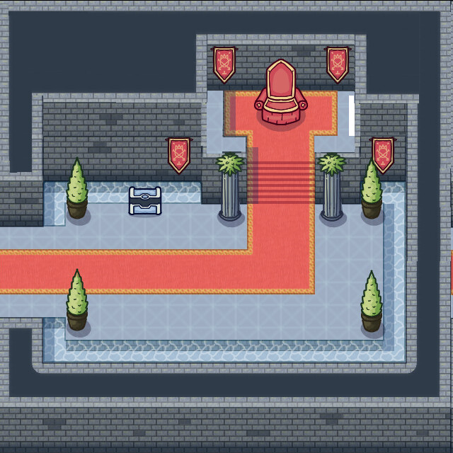
Way 1, I can move along the top.
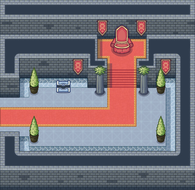
Way 2, I cannot move along the top.
I’m not suggesting you follow suit, but hopefully it helps to make my (small) issue with that part of the composition clear. I don’t know whether or not this would have any impact on your tileset design, or if it would only impact the way scenes are laid out.
I’d like to see visible lightsources of some kind. Maybe with some areas highlighted by those lightsources, and others shadowed by them. This is personal preference though, as I beleive lighting can provide a lot of atomsphere to a scene. It might be at odds with other stylistic choices or technical limitations.
I’m now going to demonstrate why you shouldn’t listen to my answer. I spent a few minutes trying to construct a scene to incorporate some of my above points. And… well, it went like this…
Yeah… my edit’s pretty bad. I think we can all see who the better artist is. ![]() You don’t need to listen to me!
You don’t need to listen to me!
Yeah, this looks pretty good.
First of all, thank you very much for your detailed feedback.
You’re totally right about the areas you circled: they’re not well positioned. My intention was to make the black area not walkable, but I have to probably leave a little gap, like you did in your last image, because the player is supposed to walk behind them with half of his body covered. Thank you for poiting that out!
This is still a concept I made in Krita, it should not have any impact on the final design of the tileset, but it will probably have an impact in the way scenes are laid out. However, I prefer to achieve a good result rather than don’t compromise a little bit.
Lastly, adding some lightsources and shadows will defintely improve the overall looking of the scene. I have to try it out and see if it suits with the art style.
Thank you very much again, if I’ll make any update to the scene I’ll post it here ![]()
It’s lovely!
You’re very welcome.
I understand the intent now. In my last image my brain still reads the floor around the throne and the top of that wall as level (ie. you can walk on top of the thin wall). Maybe something like the drop shadow I tried at the bottom could help, but I think it’s in large part because the wall stops right at the top of the stairs. Maybe having the walls stop at half a tile above whatever’s behind them would sort it. It would prevent the back wall from starting where the wall in front of it ends as well.
To be clear though, I’m just nitpicking to find whatever small things I think would improve it. Overall, it’s really nice.
I look forward to seeing more!
Here I am ![]()
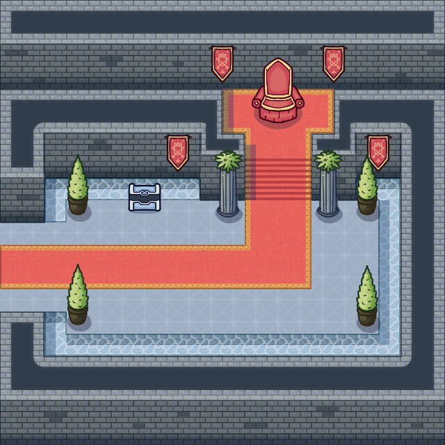
I tried to follow your suggestions and I have repositioned the walls.
I also tried to blend the objects better with the environment, softening the lineart, and made some little changes to the shadows.
I know it didn’t change much, but do you think it looks overall better now the scene?
I’m also reaching out to anyone who is still following for further feedback about the updated version ![]()
This is ![]()
Truly amazing work.
Nice one. Yeah, I think that helps - especially at the top. I imagine there are plenty of legibility edge-cases like this for tilesets at this angle, but I’m sure you’ll find solutions.
Yes, in the end I’ll definitely evaluate pro and cons of each approach and trying to pick the best solution in the long term ![]()
Looks really good
Very cozy, I like it!
hey there,
my only feedback will be that the vegetations/red carpet is poping a lot and not the chest. If i would be the art director on that project i would think contrast and color depending on the gameplay and player movement. If you want to keep the colorfull of the red and green, easy fix could be to add gold/yellow color on the cheast. Why ? because the yelow and green are the color that human eyes capt the most in the color spectrum, so be aware of that.
Otherwise i like as well the cozy design, it’s working well ![]()