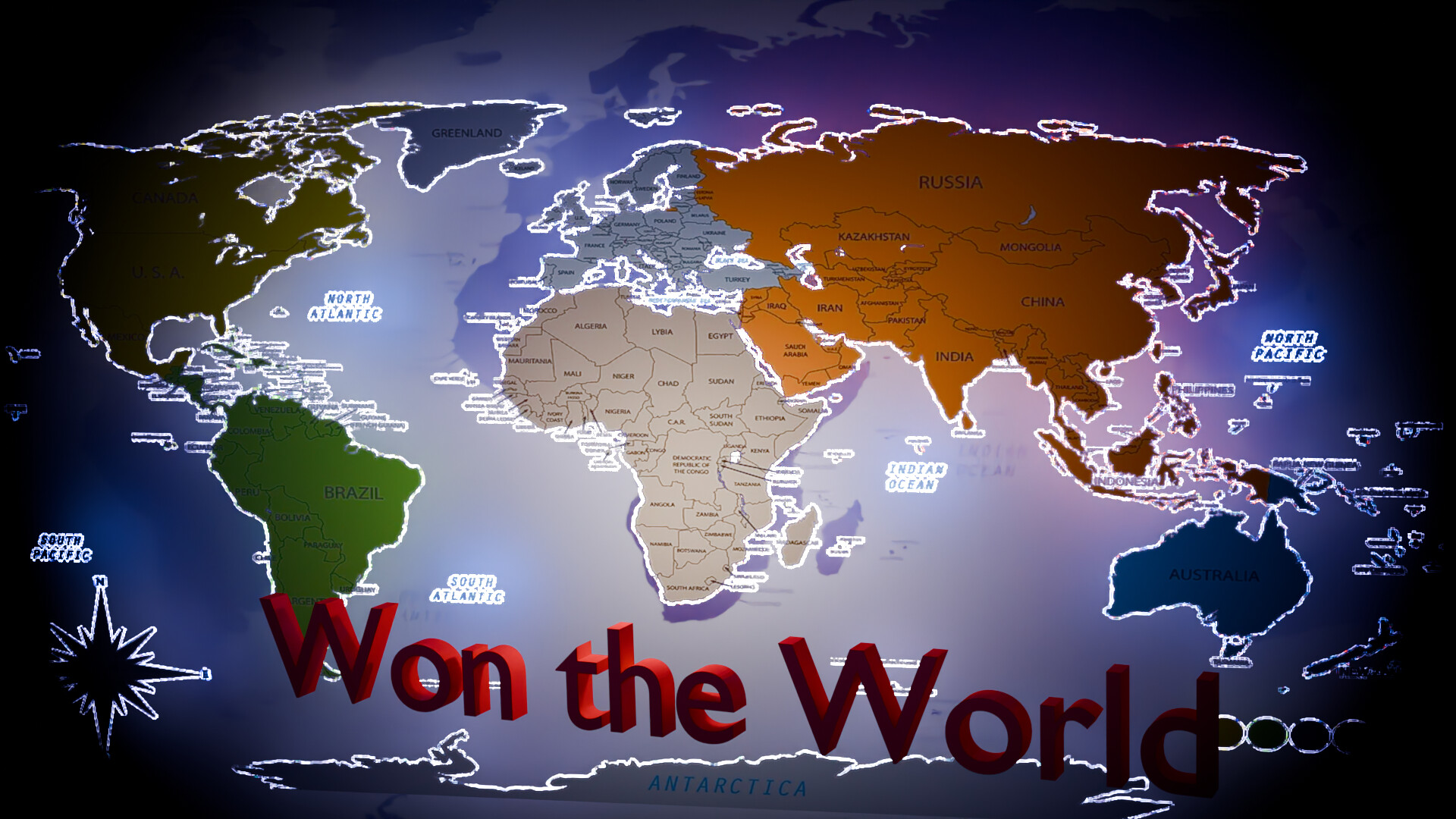
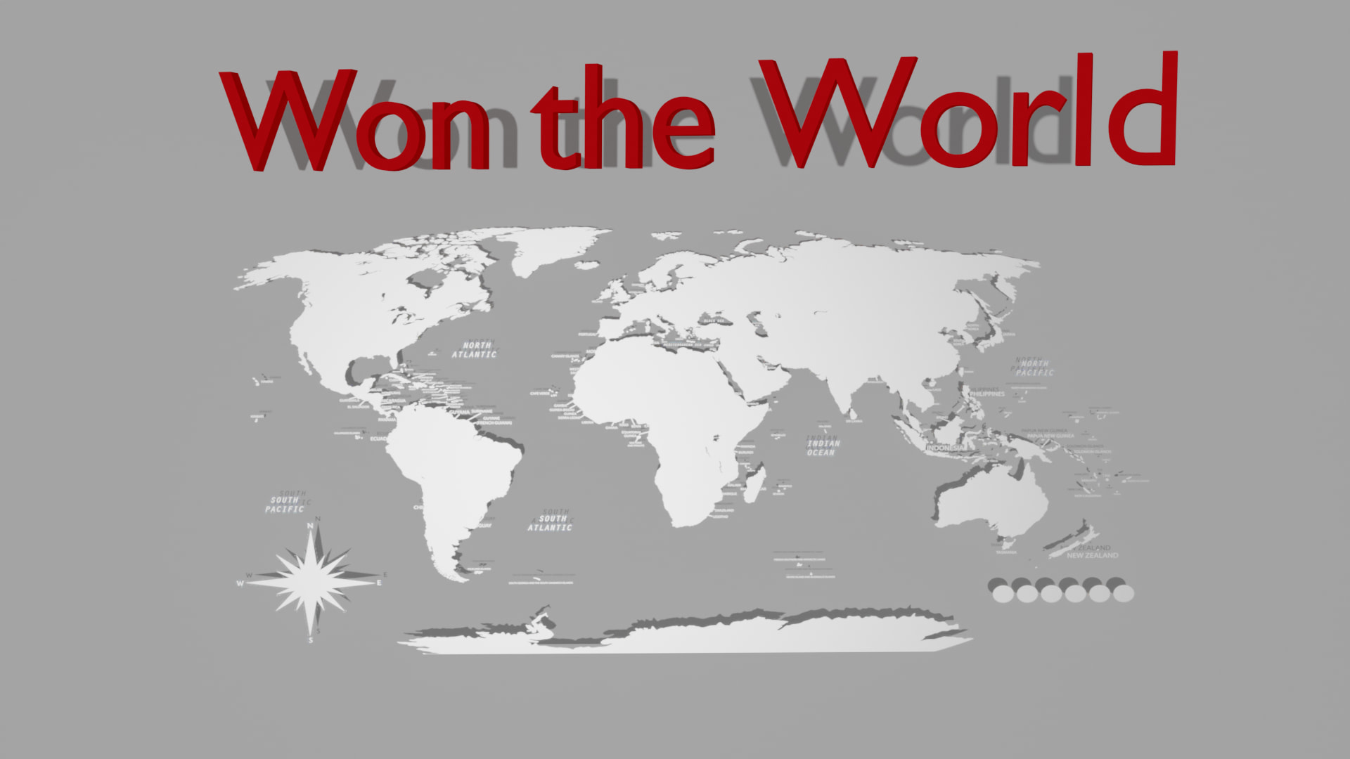
Well as you guys know i am working on my new game project “ won the World” where player have to won and rule the empire. .. so i created a logo for this..
So i just want to know is that good and what i can improve more..

Thnks ![]()
![]()
Well as you guys know i am working on my new game project “ won the World” where player have to won and rule the empire. .. so i created a logo for this..
So i just want to know is that good and what i can improve more..
Thnks ![]()
![]()
it’s soo simple,and I’ll say Godot forum is not the place for this.We’re game devs/engine devs not artists,you should look into other cool art forums.
Why is “w” in “won” not capitalized?
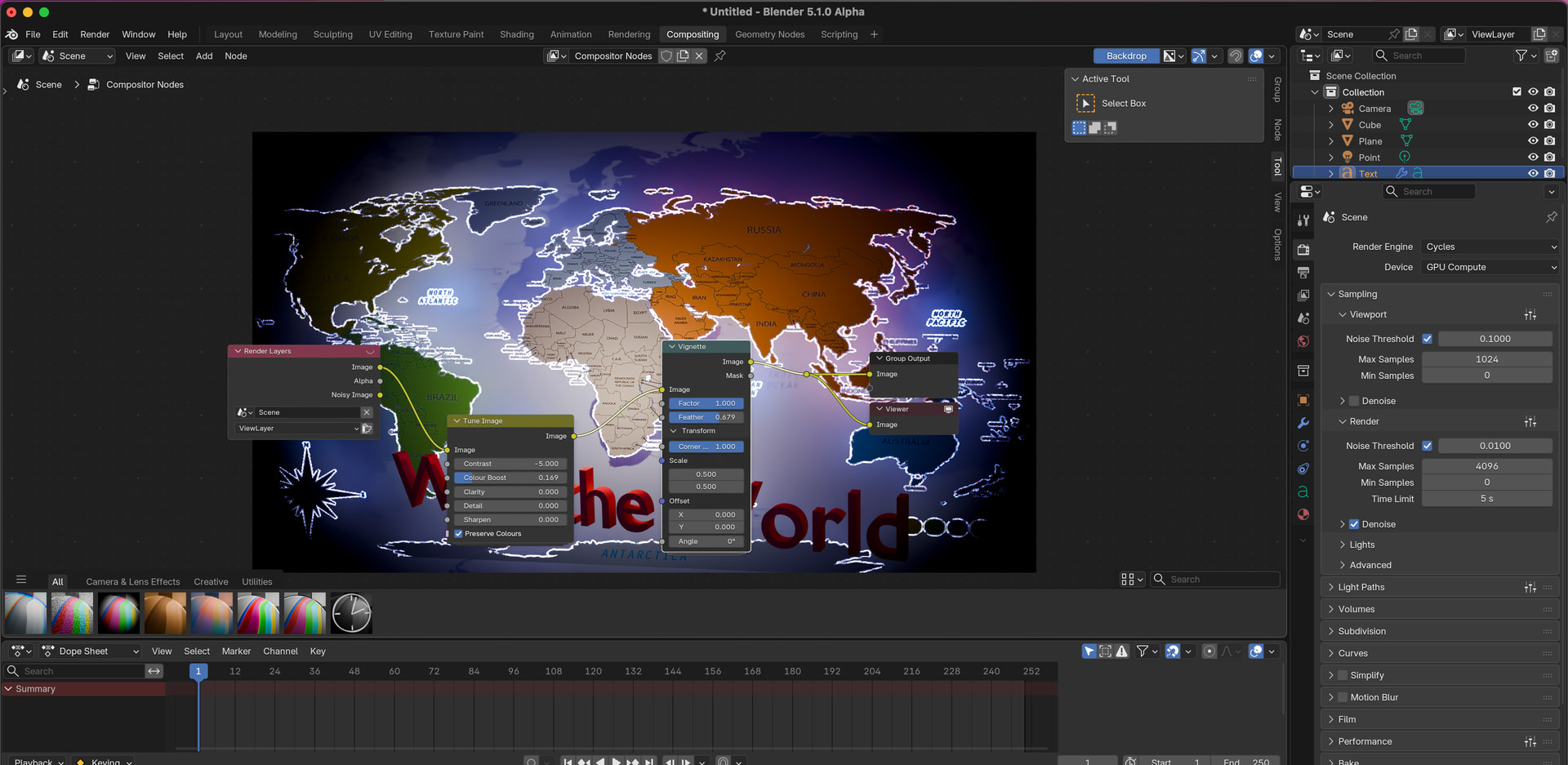
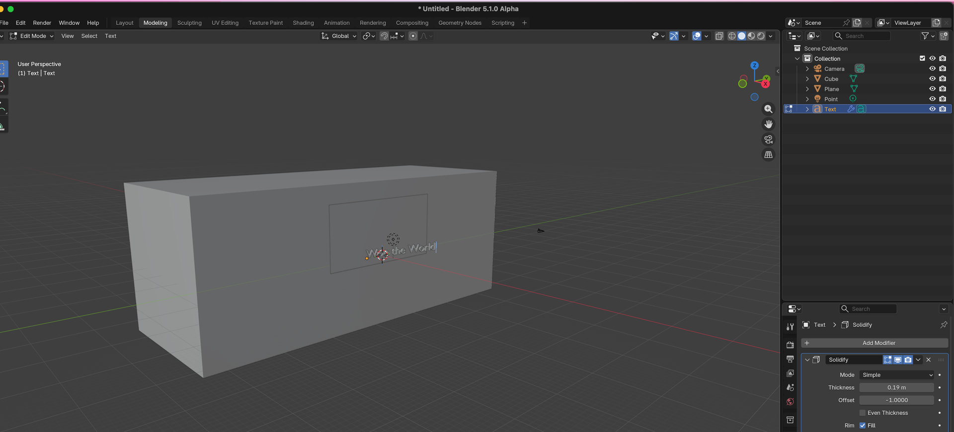
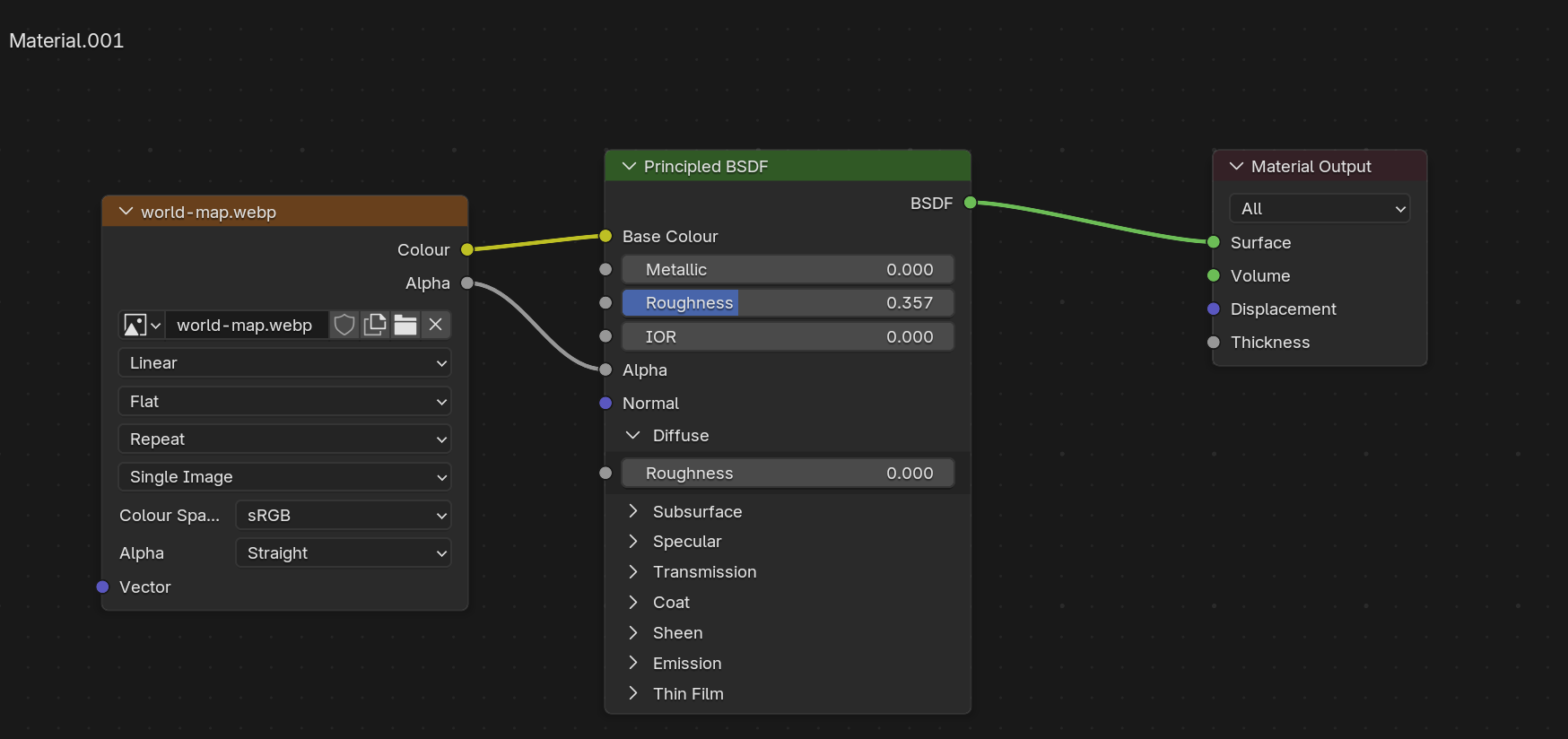
I think you could do a bit more with Blender with 3D Text , light, maybe simple composition .
Sun, object shader, world shader , can do magic
Also you can do other meshes then plane
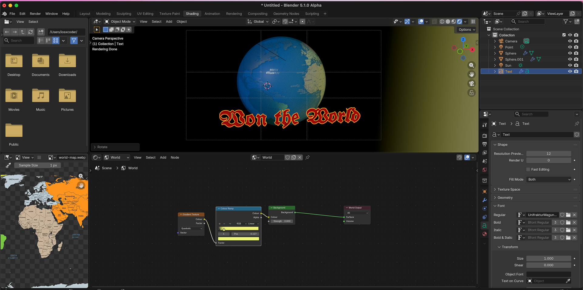
some font like https://fonts.google.com/share?selection.family=UnifrakturMaguntia
Gradient with colour ramp , extra sphere for fill
Why is the name “Won the World”? I mean, why past tense? To me it would make more sense if it were “win the world”. Like telling the player to win the world. Won the world feels like the game has already ended and someone won the world.
I don’t know, English is not my first language so I might be misunderstanding.
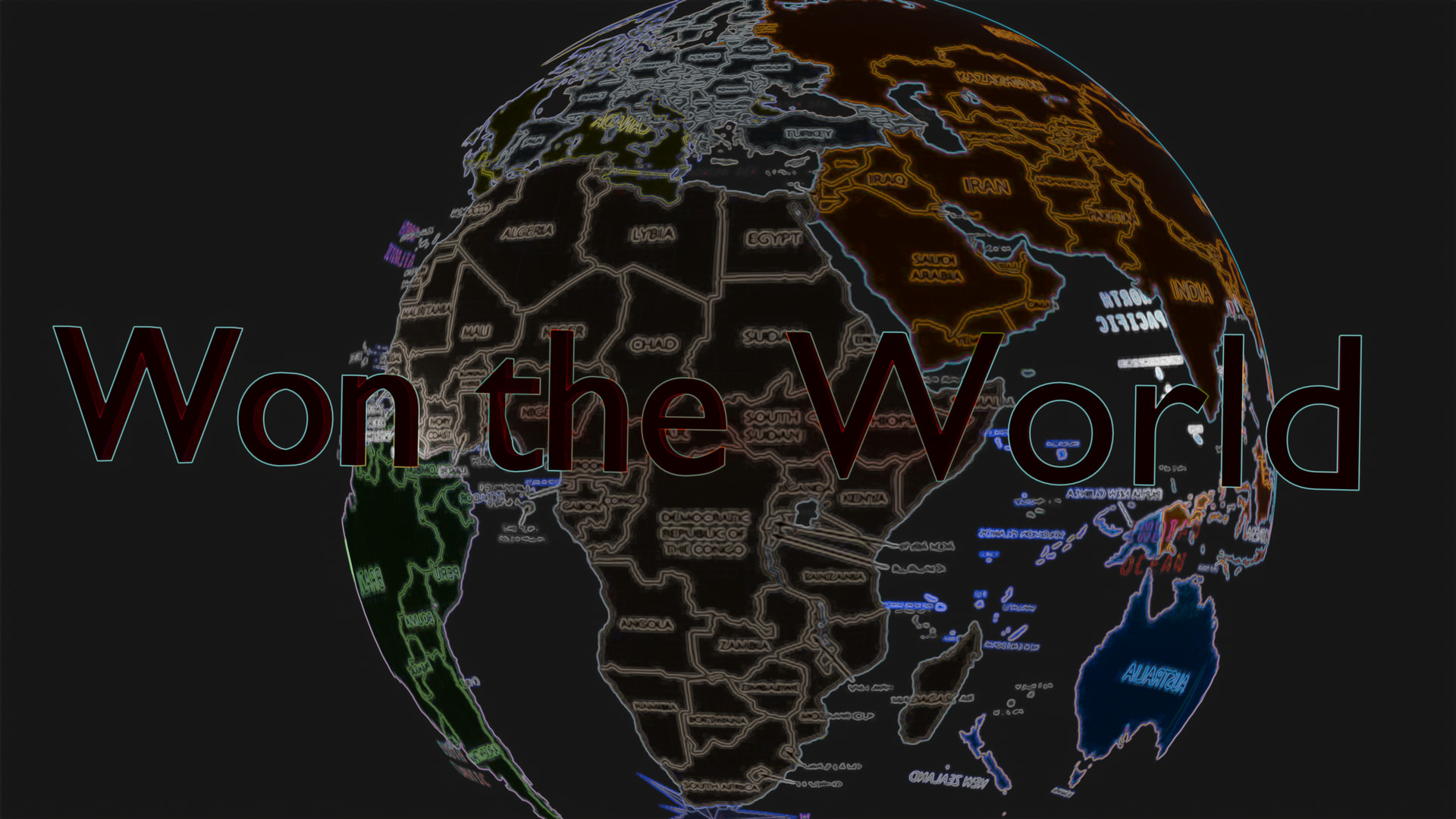
WOW ![]()
![]() .. that’ brilliant.. Master piece
.. that’ brilliant.. Master piece ![]() .. how you did this?? How brilliant it looks… WOW
.. how you did this?? How brilliant it looks… WOW ![]() . I loved it BRO.. i have no words to explain
. I loved it BRO.. i have no words to explain
At the very least raise the title so it is at least in the middle; preferably higher than the middle.
I would also try to match (as best as possible) the font used on the map.
I just forget to do it .. i Will fix it
Ok. Bro BTW font is not much different.. but still i will make it exect same thanks ![]()
Btw my game is 2d bro.. you create a earth ![]() litrelly. Brilliant
litrelly. Brilliant ![]()
I like the idea of depth to the text and the globe.
A couple of things I don’t like about this.
Well you are right to ask about this.. actually in game their is dead feature.. that makes me feel to give it name in past tense. To represent the work you had done.. so that’s why.. thanks
Well bro I know this form is for devs.. but i think. Devs should have some knowledge in art so that they can make Thier projects much better. Because player always see the art first after that Play game. The function and logics of game seems later by players.. so art is very important part..
This feels like a poster you would find as a banner on something like steam not rly a logo. Way to simple and unimaginative for a logo. A logo for this game I would say wants some kind of play on the entire won the world idea. Something like a globe with a flag in it as an example. Not like a company logo obviously but it should be a bit more imaginative.
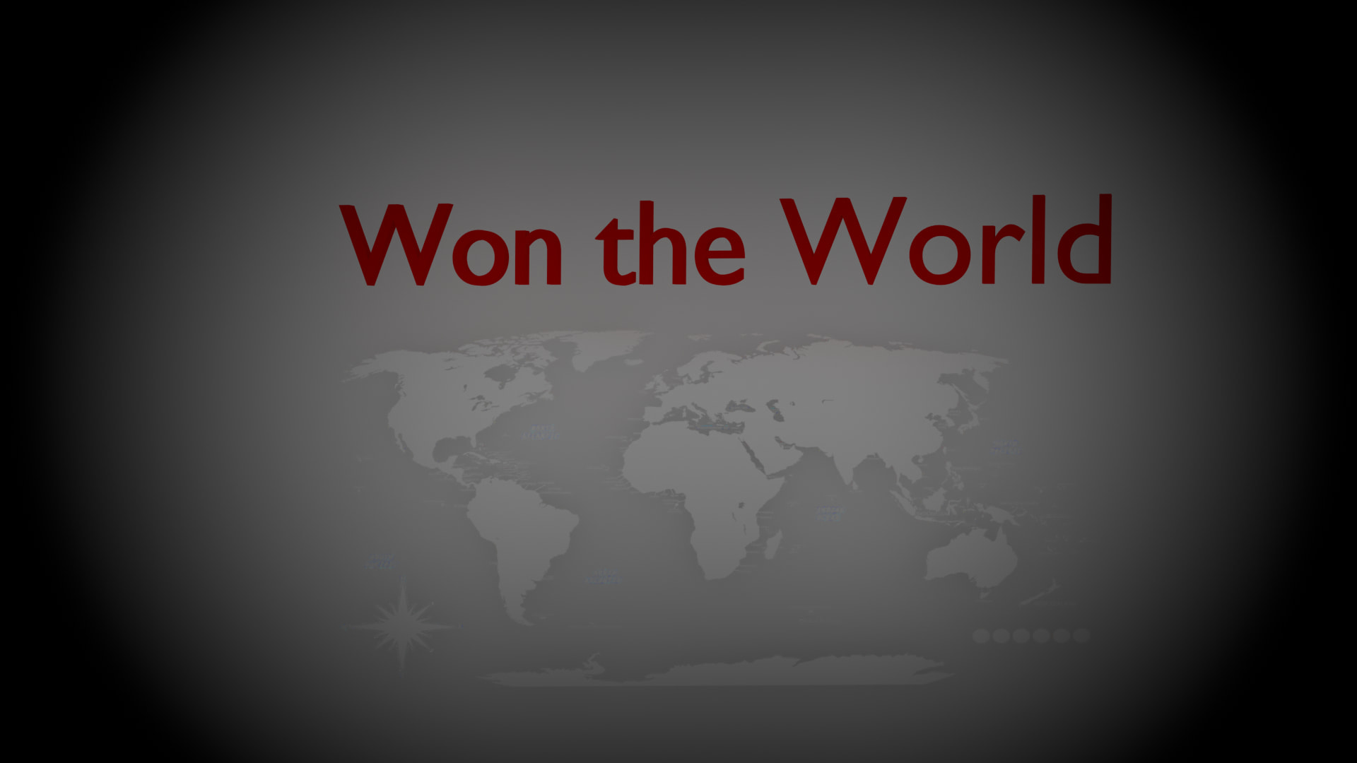
Hmm that is also good idea.. .. ![]() i will try to modify it accordingly to the name
i will try to modify it accordingly to the name ![]()