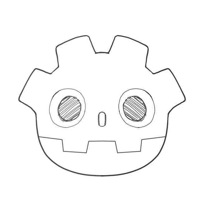
All the work form the Godot Team and Contributors on 4.6 got me inspired. Everything feels modern and great especially with the UI overhaul. I wanted to try my hand at making some kind of modern Godot Logo without changing it too much since I like the current logo ALOT. Tibos 3D Plush model was also a huge inspiration for the aesthetic. Here’s the link to the repo if anyone interested in using this:
Isn’t the whole point of the “hair” in the existing logo to resemble a cog (=engine). By reducing the spacing between “teeth” and rounding them you’ve kinda weakened that association. You also shortened the character’s forehead making them look somewhat cuter but less intelligent.
You eliminated most of hard corners, resulting in a silhouette that’s too bubbly (given that the character is supposed to be a robot). The existing logo’s contour has a visually pleasing balance of rounded and sharp corners.
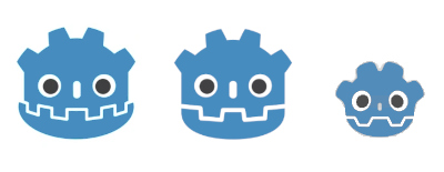
This is a great take on the mascot. Making the logo square instead of rectangular makes it work better for things like taskbars and profile pictures. Most icons are square, so this version fills the space well and stays easy to see even when it is small. It feels more like a professional logo.
Love this, very nice redesign! Personally I don’t really like the slightly cross-eyed eyes (which the original logo has as well … could you try a version where the irises are just in the middle of the eye to see how that looks)? And I think the nose could be a tiny bit bigger, so it fits in better with the other parts aestetically and doesn’t disappear if the logo is only shown very small. Haha, now that I’ve thought of it I can’t unsee it: It looks like the child of the og logo