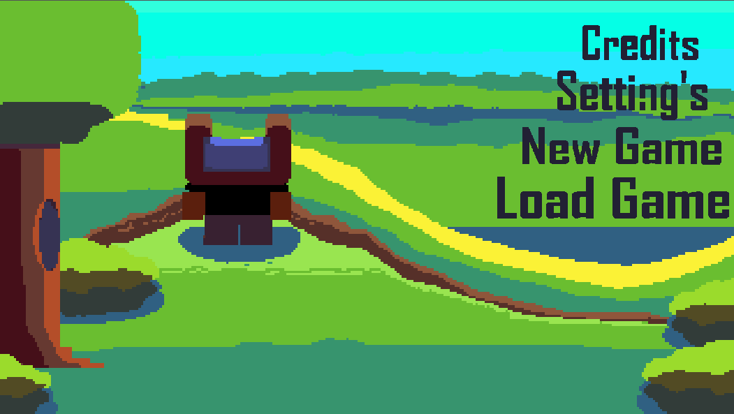
I made a title screen for my game recently, but I’m not sure if I should change the background or not, I think it looks decent but I wanted to hear some cut throat opinions on it, so if you see anything I could improve, let me know.
The buttons you see on the far right represent different universes if anyone wonders why they look so different from eachother.
Some feedback (in no particular order), that is hopefully useful.
The transition from the title to the menu was lovely
The background image is wonderful
I don’t like the menu items being right aligned
3.1 Them being on the right side is fine, but I think being left aligned would look better (although I wouldn’t know without actually seeing the difference)
Menu items are in an unexpected order
4.1 I’d expect New Game, Load Game, Setting's then Credits
I think you don’t use an apostrophe in settings
The (I assume) click effect makes the text very hard to read against the background.
6.1 I’m not entirely sure what that effect is if I’m honest? I’d assume if you clicked anything you’d be taken to another screen? Is that click effect something that would show before navigating you to the new screen?
You only showed a relatively short clip so maybe this happens, but it would be cool if the little character played different animations if you sat on the menu for a while
I generally tend to prefer proper sentence casing for menus
8.1 i.e. Click anything, New game, Load game
Happy to answer if you have any more specific questions!
PS, im a new user and can only put 1 image in a post, so i put the full respone on github, link PLEASE VIEW IT ON GITHUB
I love how the menu is creative and sets itself apart from other games.
The hard cut between the title and menu threw me off. Maybe just a simple zoom transition or just a zig-zag thing would be better.
PLEASE VIEW IT ON GITHUB FOR IMAGES
2
“The buttons you see on the far right represent different universes if anyone wonders why they look so different from each other.”
I think this is a great way to make the menu feel like part of the game, but it blends in with the background too well. Maybe a shadow, or a bigger outline, but I say keep the cool text effect,
If your clicking on the buttons to send you to different menus or parts of the game, you will only see the cool button art for only a split second, so i think a better idea would be to have the hover effect be the art instead of the clicking, i think that this wouldnt be distracting becauase it only shows when your hovering.
One thing to think about is the perspective in this shot.
PLEASE VIEW IT ON GITHUB FOR IMAGES
The bear (i think it’s a bear, like maybe a teddy bear???) is facing to the right, in the next shot,
PLEASE VIEW IT ON GITHUB FOR IMAGES
The bear is facing forward
The thing about this is that for the first angle, the camera would be here (the black cube) and pointing forward (the orange arrow). This might feel weird or off to you or some people, and I think the best thing to do might be to make a mockup of how it would look at a different angle.
PLEASE VIEW IT ON GITHUB FOR IMAGES
This is a very small thing to think about, but it might feel better to you if the camera were in front of the bear, looking at the feet, maybe like here?
PLEASE VIEW IT ON GITHUB FOR IMAGES
5. In the first (close-up) shot, there isn’t a lot of detail on the bear; adding some detail would make it look more like legs.
One major thing to think about when doing detail on the legs is the direction of the light. Based on the shadows, the light looks like it’s coming from here.
The scale seems Off. In the first shot, the legs seem HUGE compared to the thin flat ground (being thin and flat makes it seem like the ground plane that your looking at is big, making the legs seem even bigger, A way of putting it is like this, in the first shot, it seems like if you dropped a person in there the person would only be as tall the the bears toe, but in the second that it would be almost as tall as the bear.)
Those are my thoughts, if i think of anything else ill add it,
Firstly I wanted to thank you both for your feedback before anything else, I also apologize for it taking this long to reply back, I wanted to show something new.
To make the texts more readable I put some outlines on each of the words, different colors for each button, I’m still debating on if the click texture for all of them should be fully white or just an outline of it, tell me what you think based on the video I’ll post below.
I’m gonna create a image with an angle from down below closer to the feet like you described, facing the player’s front side and all.
Also the character you see is a human singshot thing , I’m gonna work on a new background with the angle idea you gave me, then put the old and new backgrounds side by side so you can compare the two; I’ll mess around with transitions to see what works.
Hello to those still interested in the thread lol, it got really busy these past few weeks, but heres what I have to show for it.
I made the miniture menu for the new game button and the settings button, they have minimal funcationality right now, but soon each button will have its designated menu linked to it, and all of its features available to the player (I also need to create I proper file save system for the “new game” and “load game” miniture menu’s to work properly, so that will take some time aswell).
The transition between the start screen and main menu now also has a black-out affect so it feels smoother.
Here’s a short video displaying my most recent changes:
(This will probably be my last reply to this thread, thank you guys for the feedback on my menu, I also still plan on creating a new main screen to show at a later date and trying out some of the other great suggestions, you guys gave me. Thank you to specifially @Rogue7Games, @lZebl, and @gentlemanhal for your amazing feedback and kind words.)
Yes the N is supposed to look like that; its hard to see in the video but each letter in every one of the button options has a unique flare to it (my screen recording sucks so it looks alot worse than it should), I made the N look that way too give it character (and it might be changed later on in development).
The videos and comments I posted above show what all of the buttons look like and go into my thought process when making them.
With that being said, I’m also debating if I should keep the colorful texts or have a more basic click and hover effect for the buttons, it feels a bit noisy with what I have currently.
I’ll try out some different and more basic color palletes to see what sticks, thank you for your feedback.
Lose the apostrophe on settings, otherwise it reads “setting is”. I think the shaders on the font is neat, but maybe stick to one style per word instead of each individual letter. I would also put a dark, transparent underlay for the text to make it stand out just a bit more.
simple colors for text-hover effect, or minimize color count, or polish text color, ie ‘a’ in Load has strange background, looks more like an error than design choice
move words 1 letter to the left : credits_|<screen edge
keep words order as is, it subtly suggests the hierarchical structure of the universe itself (and looks nice)