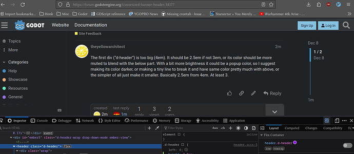
The first div (“d-header”) is too big (4em). It should be 2.5em if not 3em, or its color should be more muted to blend with the below part. With a bit more brightness it could be a popup color, so I suggest making its color darker, or making a tiny line to break it and have same color pretty much with above, or the simpler of all just make it smaller. Basically 2.5em from 4em. At least 3.
Could you make a screenshot which part of the site you are talking about?
Hmm, I’m not sure. Currently it’s roughly the same size as the official website header: https://godotengine.org/
In homepage I can scroll and it goes away, but in the forum it never goes away. And it takes a lot of screen space, the most important space too.
Also in the official godot homepage, it blends with the background in color, here it contrasts it. See Github’s header, the header is very close in color with the content.
You have some good points. I’ll wait for others to add some opinions, but I think it’s a good idea to rework the navbar.
GitHub issue for tracking: Make navbar less obstructive · Issue #6 · godotengine/discourse-theme · GitHub
1 Like

