This looks really good so far. The combat looks fun too. Nice job.
1 Like
Thank you so much for taking the time to look through it and comment dragonforge-dev ![]()
I loved the art style also the combat animations are juicy but,I don’t know why my eye can’t see the blue guy in the warm environment? is this a part of the story?
Btw the character’s head kinda looks like Godot ![]()
1 Like
Absolutely charming and gorgeous!
I would suggest a limited palette for the UI though. There is a lot happening color-wise in the game and the UI-overlay. Simplifying the color-range would do a whole lot for its readability! There needs to be a focus and as of now there isn’t!
Keep up the great work!
1 Like
Thanks Frozen_Fried!
You’re spot on - I think I’ve over-tuned the colours a bit there to really sell the whole sunset look.
There’s been a lot of talk about this issue actually; so I’ll make sure it’s dialled down a bit.
And yeah his head sort or looks like Godot haha. Maybe I could make a small animation where the two heads morph into each other when you start the game
1 Like
Thank you for this thesnooze!
Very encouraging to read!
Would you have any suggestions for the colour palette (specifically the UI)?
1 Like
That depends on the palette of your game and the UI should somewhat contrast that. For example if you have predominantly warm colors in-game contrast with cool tones, or high saturation in-game contrast with low saturation.
Start with a narrow limit of colors that are either close by or adhere to a color theory (complementaries are very often seen in UI).
The black/white/orange/blue combo that counts your hits works really well in my opinion, since it adheres to what I have described above. I’d use that as a basis for now until you have better understanding of the color world of your game.
1 Like
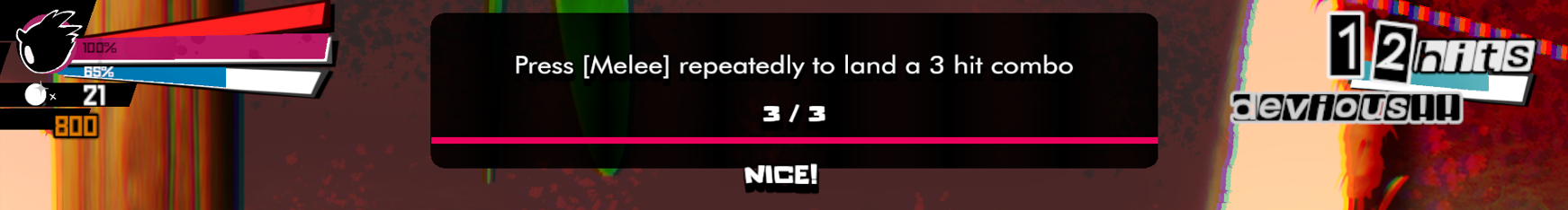
Agree with @thesnooze. I like the colors of the hit counter, but I don’t like how it doesn’t stay consistent with the top left HUD stuff. I prefer the style of the top left HUD with the colors of the top right hit counter.
1 Like
I’ve realised I’m more attached to the orange/blue combo on the hit counter than I thought - but for the sake of uniformity; I’ve tried muting the colours a bit and changing some of the orange to reddish-pink. As a fair bit of the UI is starting to use this colour scheme.
Open to playing around with this however; but: -
Thoughts?
Yeah for sure @ComicallyUnfunny , I quite like the colours on the orange-blue combo, I might try and tweak things to make the rest of the HUD work with it; but the tutorial display in those colours didn’t quite look right IMO. It’s been one day though, I’ll try again and see if I can make it work.
2 Likes
It’s amazing. I have to go now - be back later tonight.
1 Like
Yeah man! The bars in the top left corner feel way more closer together now!
2 Likes
After a lot of thinking, I’ve decided on calling my company “Project Taro”!.
Here’s a preview of the WIP boot-up / splash screen

2 Likes
Thanks to @willthoven, and a chunky overhaul of the code for audio over the weekend, we now have adaptive music ![]() !
!
With enemy hits to match ![]()
Preview of the hits:

2 Likes
Your attention to detail is very inspiring! You clearly have a great gut feeling of “visual sugary” and bringing life to the things you do. Besides the obvious quality in movement I especially adore the boot cracking the screen ![]()
I do share some concerns about visual clarity here though. Some loose thoughts:
-
There is so much happening on the screen center area - your HUD should not be in direct competition with it. The hit counter could provide a visual indicator towards the middle of the screen, instead of flipping in the corner (Think pulse, wave signal). And the blue energy bar, too. Instead of doing the angled “rocking” motion you could also just give a center-oriented animation. (Think particles spraying from the bar towards the middle.
-
Following the gist of seperating PiN from the background: you could try removing or limiting the shader effects on PiN when hitting, so they keep standing out even in hectic situations.
-
Regarding the HUD colors: this would be a great possibility to introduce some accessability into your game
1 Like
Hey ximossi,
Thank you so much for your kind words! Haha yes 100% - the boot flying and cracking the screen was one of the very first things I added ![]()
Also - I really appreciate your time to give this feedback, thank you.
- Yeah I absolutely agree. I’ve been meaning to at the very least, change the rocking motion with exactly that - particles that spray out with maybe a subtle glow instead. The middle space atm is reserved for the medal count, which moves down temporarily to update your total upon collecting one. But I will try a pulse in the middle with the hit counter too.
- This is one of the main concerns I feel - so far I’ve added fog in the background and reduced canvas darkness overall, however the shader and particle effects might be too strong. I’ll tweak this further.
- Definitely a good shout; even more so when it’s been one of the main areas for improvement!
Hey! Very nice project! I like too much from the sounds when the hero is fighting! But seems to be like modern games and I’m old school player! Hope you keep that good working! ![]()
1 Like
Thanks gold_angel_corp! There’s a playable build coming very soon!
1 Like
Should have something playable in a few days!
In the meantime, I made a trailer for the demo:

PS. I accidentally turned PiN’s point light off while recording, so he looks a little hard to see again at some points.
Luckily it’s not like that in the actual game now.
5 Likes
Looks fantastic!! Can’t wait to play.
The shader effects on the enemy does make it near-impossible to comprehend what’s going on, though. That level of shockwave should be reserved for a boss and accompanied with heavy slowmo so the player doesn’t lose the ability to react (know what I mean?).
They look super awesome, but once again, clarity is an issue…
1 Like
Yeah true … it is a lot of noise tbh..
I’ll disable it today then.
Sometimes you worry there’s not enough happening, you end up overshooting to fix it ![]()