I am making a game based on minigames and the basis of some minigames are color references, I have realized that it can be distressing for someone with color blindness
It is infinitely easier for me to stick to a color palette than to start modifying shapes, plus colors are much quicker to identify and remember than shapes and some minigames are quick.
First off, just using a specific palette will never work for everyone. There are too many different ways in which people perceive things visually.
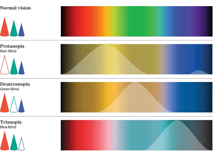
That being said, color palettes like you posted work a lot with luminance. So colors that would be similar by hue, will have a different luminance. So while to you the green and blue seem like different hues, to someone with trianopia they will seem like a similar hue but with different luminance.
It’s definitely better than using arbitrary colors. But to make it work really well, using shapes/patterns is a lot more effective. Here are a few ideas how to differentiate things without colors:
symbols: these can be on the object, or above like a health bar
patterns: instead of solid color fills, use patterns like dots or stripes with high luminance contrast
text: have labels for objects, for example above or below them like a health bar. Or directly on the object if large enough
shapes/silhouette: sometimes it’s possible to make the whole object unique
behavior/location: if objects stick to specific behaviors, that may be enough to distinguish them. For example if enemies always move from right to left, while power ups fall down from the top, then our brains will be able to distinguish them
effects: objects can have different effects. Power ups may emit sparkling particles. Enemies may leave footsteps. Bullets leave trails. Bombs pulsate before exploding. And so on. This can be quite useful if the object shape can’t be adjusted.
So it seems, there is no magic wand that fixes colors for everyone…
At least I have been able to find a lot of information and in the end I have found a good page in case anyone sees themselves in the same and wants to try color combinations
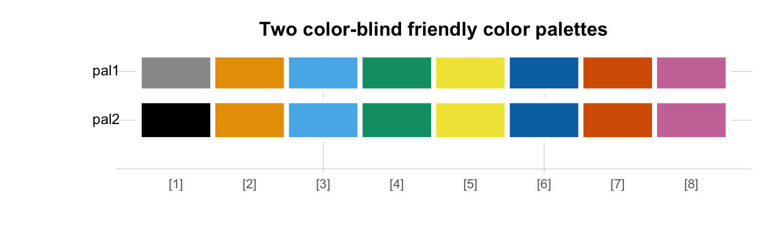
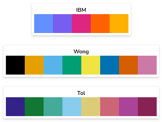
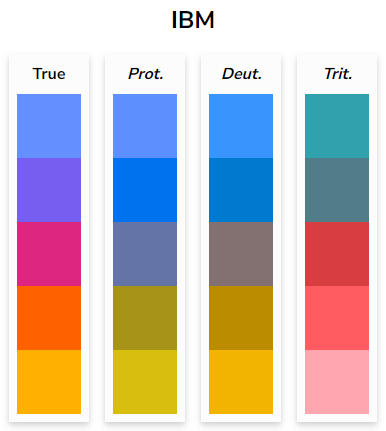
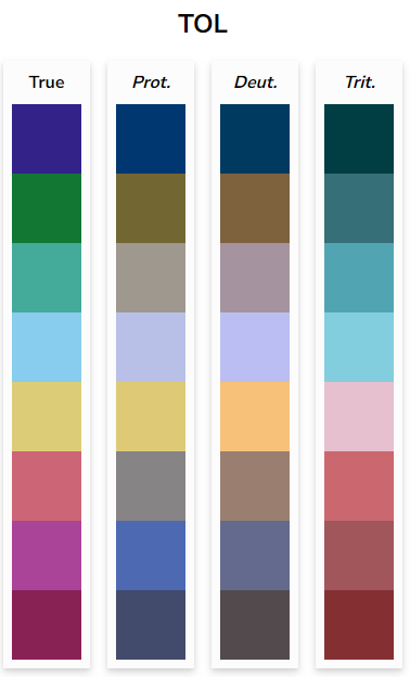
A number of color palettes have been developed with the intention of being accessible to people who are colorblind. Three of them appear below, from the IBM Design Library, Bang Wong, and Paul Tol respectively. Click on any of them to load it into the color palette selection tool above.