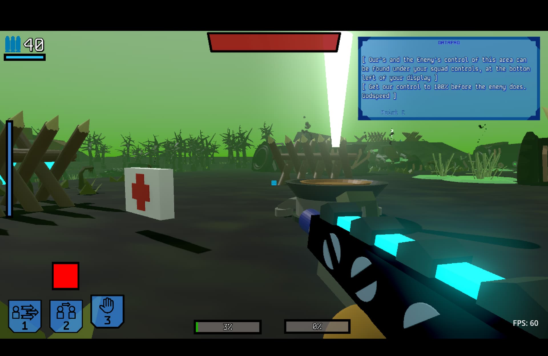
As you can (hopefully) see, the UI in the second screenshot is much easier to understand, and doesn’t clutter the screen as much. All feedback on any improvements needed is greatly appreciated!
First, it’s important to stress that im not an experienced game developer, i come from web dev. So have that in mind - my feedback might not be in the same value range as an experienced game developer…
So it’s up to you whether to give the feedback any value or not, and overall i think what you showed seems quite nice Again without being a game dev, so others might have other thoughts.
But i would like to see the icons in the bottom a bit smaller, same goes for the number so it doesnt seem so cluttered in there.
Maybe a percentage with white text in the health area, and a menu bar or icon to open a menu for settings etc.
And to give a really nice feel to the game you could make use of a UI overlay theme like you see in some games, where the graphics behind the 3 icons could be some sort of overlay to give a bit more play to the ui. maybe a overlay that fills the screne on the horizontal axis.
Like you could have small clips play when you get to certain areas in a small window beside the icons with your “Commander” which tells the missions or similar which could be a cool nice part of the gameplay.
But overall, of what you’ve shown i think it’s pretty good The things i mentioned overall are non critical things i think but things that might be able to give some more power to the UI.
But as i said, take things with a grain of salt since im a new developer in the Game genre, and as such my knowledge is not at a top level. Maybe wait to see if some more experienced developers agree or disagree before using any of the feedback given by me
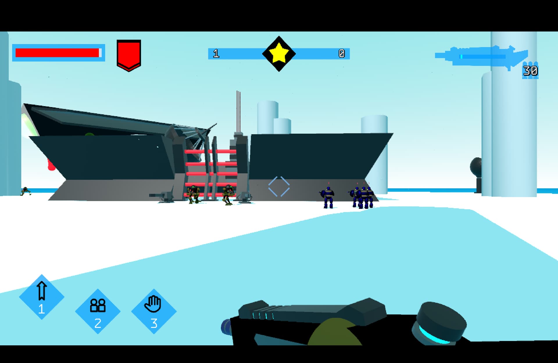
I quite like the revamp. The gun blueprint in the corner is also a nice touch. Reminds me greatly of the Xbox 360 FPS days.
As for feedback:
Keep it Simple Stupid is always effective, but it’s important not to let it hinder on the style or character. I think the corners could have some framing art, or bordering. I see what might be a scifi city with androids guarding a lazer door. But the Clean and Flat portrayal doesn’t give anything to that. The Bright star in the center in particular gives me Steven Universe vibes lol, though that might be standin art.
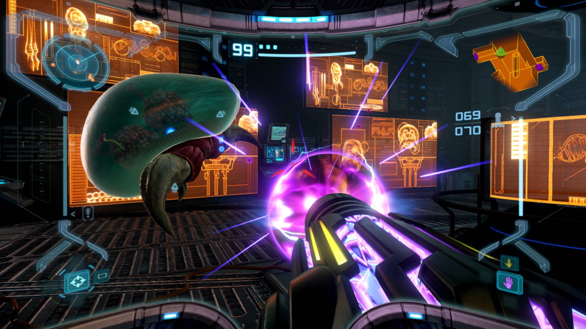
A fantastic example of borders and style for sci-fi would be metroid prime. You get the physical helmet bleeding into the frame along the top and bottom, along with the hologram effect of the ui; made by curving the art along the focal plane, and then simply copy pasting it again but bigger to give 3d depth. screenshot (https://www.pockettactics.com/wp-content/sites/pockettactics/2023/02/metroid-prime-remastered-review-16.jpg)
Now of course you don’t have to go all this way, and you’re most likely not a nintendo funded developer. If your style is perfect as intended, then I have feedback for that as well:
Some borders on the elements would be nice. If you could angle them individually to recreate the focal lens, that might also look nice. Borders also can help with visual communication which has been a trending attribute. You’re number 1 skill looks to be equipped for sure, but if all 3 of your skills had white borders, and your number 1 had an orange, or whatever color border, it would go that much further. You could also use the borders for notification, health or ammo low, and thus flashing.