Dwarven Mint for me was like “omg, I like this idea, and I can actually finish this game” so I finished a prototype in 4 days then kept working on it quietly after work for 1.5 years- now I am swallowing my pride and forcing myself to show it to people even though my brain is screaming “no, it’s trash, don’t show it to anyone” but I love it and I loved working on it!!
It has the one thing I wanted from my factory games: just let me make a real mess and sort my way through it. The ores, nuggets, coins and (coming soon) gems are rigid bodies (even some of the smoke objects are rigid bodies).
There are conveyor belts, but they don’t just neatly move your items in a queue like factorio- they just apply a force. There’s also a speed booster, a bunch of other unlockable components to help you sort out logistics.
It’s still in its early stages (I guess) but who knows, you might have fun testing it out: apple store google play
One thing I have learned over the last month → avoid making shorts/tiktoks (or any material) that just says “I made a game” or that formula “I spent 4 years making this, come look”. They just look like ads. For the reddit posts too- I think it’s better to create something more like “here’s what feature I added this month”
@normalized this month I am implementing gems which can be cut then set into coins with a jeweler component.
The gimmick is that each gemstone needs to be passed through a polisher n number of times, meaning you have to build in some sort of check to see if a gemstone is finished being polished else have it polished more. (it’s a late (maybe mid) game thing so I made it much more challenging than the other stuff)
@pauldrewett At least I can bring myself to post it here- I can’t bring myself to show friends… not enough inner peace or humility or something. But yeah- def need to at least have a trailer that shows building mechanics
Overall I think it’s a really good puzzle game, with novel gameplay that’s still fairly intuitive to grasp. The presentation is nice, the controls work well even on phone, all in all a superb package
For me the complexity (and difficulty) went up very quickly, and by level 6 it felt pretty daunting. I tried the first bandit level as well, and couldn’t find any way to make progress at all… were I just a player, that’s where I would give up and not look back.
Part of that feeling is from the long levels, with multiple stages, which is cool but a bit involved for an early puzzle. The number of machines (as I’ll call them) available is also a little overwhelming - you could consider doling them out as unlocks, leaving just the ones the player has need of in the early game. That way each one is a useful and earned reward.
Some notes:
Might be better to have the main menu snap to pages rather than free scroll. I’m not sure how the free scroll improves the menu
It’s hard to get an overview of the world map - it would be nice to indicate visitable locations more clearly (maybe just a panel behind their text / an outline / …), and see information like locked/unlocked, levels cleared, and fully cleared, without selecting a location first.
Paths could be clearer too
It’s not clear what the down-the-stairs / up-the-stairs icon does, to me at least
Gameplay:
The coin counting is a bit confusing. It seems like the biggest spread of (correctly) collected coins is 5, which I don’t think was explained anywhere? That feels somewhat arbitrary.
The count also seems to reset sometimes even when no incorrect coins have gone through, possibly when an incorrect coin gets stuck somewhere.
The coin goals (like in Edmund’s Secret lv 5) are quite high, which means more risk of a late mistake that will force the player to start over. It can also get a little tedious when the “puzzle” is solved, and you just have to go through the motions to get to the finish.
Might be good to show the name of a machine when selecting it, or make them more visually distinct. I regularly wondered what a particular thing in the level did, which is only described in the shop.
Maybe long press or similar to remove a machine, it’s easy to accidentally remove one, especially on phone. Nice that they remain bought though.
Wow @phoenixdk it really means a lot to me to get such an in depth review, I really appreciate it.
First issue describes complexity (and difficulty). I did (and still do) struggle with level design. I think my insecurities were driving design- top of mind for me was “I hope the player doesn’t get in here and just think this is a very simple, dumb game”. Level 5 had a whole set of next objectives that I think I made the right decision when I chose to cut them out. I am terrified of removing unneeded components from the store early on- why? Many players will only try the first few levels and I’m terrified if they don’t see some of that complexity early then they’ll think it’s a very simple, bonehead game and move on (my target niche being people who like factorio but are like me intimidated by the long play sessions).
Ah, the main menu. The whole idea of the game was “if people know how to scroll, they can figure out the game (hopefully)”. I think free scrolling comes naturally to anyone scrolling on their phones, tho you’re now the second one to cast doubt on it. I suspect tho the real friction came from not knowing that you could scroll at first on the main menu.
The world map - the number of “type” of location quickly ballooned with scope creep so I relied on UI elements to describe them. There is so much information to display about the locations I don’t think it could fit on the map and also be clear. I do intend on trying to keep it just ink and map color- I love that it kind of resembles a map and not UI. I do need a better way to do paths.
The upstairs/downstairs button allows you to see underground locations as opposed to above ground ones. (that felt like scope creep at the time… but I love it haha)
Coin counting: you figured it out- one objective can’t progress more than 5 units pasts the rest of them- else you could simply clear one objective at a time without building out the full setup. I need a way to explain this without drowning the user in text they don’t want to read.
Coin goals- yes I probably need to set the coin goals on lvl 5 to be a bit lower. Good call.
NGL- I can only respond to so much of you epic post before shutting down and going back to just work on the game lolol
Don’t rush this part. You are quite right and sticking loads of text in a last minute dash to ‘explain’ things is a bad idea.
If you have levels, have the first three as tutorial levels. Level 1, show the scrolling thing. Level 2, show the losing coins past your extension limit. Level 3, show some other mechanic. Show, don’t tell. A single flashing icon can tell the player a whole lot.
Also, could you not have barriers that one coin cannot break, and it only breaks when all the coins available or currently in play are resting on it? Just an idea.
Thank you, but you really don’t need to explain yourself, or respond at all. I see my notes as just that - some thoughts I had that you might have use of
I stand by my observations though, particularly with the world map. It feels somewhat underdeveloped compared to the rest of the game, and doesn’t communicate very well.
There are plenty of ways to convey more information, I think - for one the map is zoomable, so you could space however you need. Things like marks, circlings and scribbles are still in theme with the map, but you could call it a dwarven map and get away with having glowing letters and runes on there… in any case, I’m sure there is a way
Version 1.34 live on apple, soon to be live on android…
actually it’s my first time having a platform force me to update- so after 1.34 I need to migrate from godot 4.5.1 to 4.6. Hopefully that doesn’t mean retesting every level in the game.
For the new version I edited all the first levels to make some of them a bit easier and to make more tutorial type messages stick around longer. I hate in games when people gate my progress behind clicking through tool tips ect but I guess you really can’t always avoid it- like @pauldrewett said at the best I can do is keep it to a minimum.
@phoenixdk I’m sure you’re right that the map still needs more love… but the people that got stuck certainly were not to the point where they could explore the map much for any reason, so I feel like I’d better just stick to the first 5 minutes of game play until more people can figure it out.
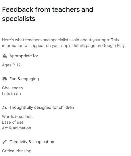
I am sharing this feedback I got because originally I was denied google app store’s "Teacher Approved program" status.
All I had to do was request them review it and tada! They approved me!
The point apparently is that we get “Increased Visibility & Trust”… but we’ll see.