Funny you choose a studio who is known for plagiarism and uses AI like crazy as your example. And ads that don’t reflect the actual game…
Edit : removed erroneous ref to trolling ![]()
![]()
Oh yeah, I forgot that that game uses the clickbait ads. It’s a bad example. I’ll remove it from my previous reply.
It still doesn’t change my stance on AI art in game icons, though.
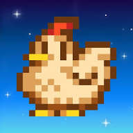
Think of stardew valley,
It’s just a simple little chicken that would take 5 minutes to make
Also it’s not the greatest icon ever
Great example here. This is exactly what I meant.
The Subway Surfers icon is basically just a game screenshot with some effects in Photoshop:

Logo and Name are those 2 things that never get that premium and brand feel by default,the product makes it brand
–My 2 cents
@ComicallyUnfunny @OleNic @Frozen_Fried
Thanks a lot for your feedback and great examples guys. Very helpful and inspiring ![]()
Very wise one! ![]() Deserve to be printed and displayed on a frame!
Deserve to be printed and displayed on a frame!
@shrek-does-game-dev I gave a look at your art and if it’s your first try I’m impressed, I didn’t had that kind of good result myself when I started ![]()