If you have any improvements for the style please tell me i need your opinions to improve, i have a base for the game i now just need to get some art done to progress.
BTW this is a Horror game.
If you have any improvements for the style please tell me i need your opinions to improve, i have a base for the game i now just need to get some art done to progress.
BTW this is a Horror game.
i don’t know why is so low quailty on here sorry
When designing characters it’s a good idea to put them against several backdrops that will typically appear in the game to see if character’s silhouette reads well in its intended environment and fits stylistically into it.
In general, your design could work. Imo it has several details that may be too tiny. Either make them more prominent or eliminate them. The drawstrings on the hoodie attract too much attention. They shouldn’t be pure white.
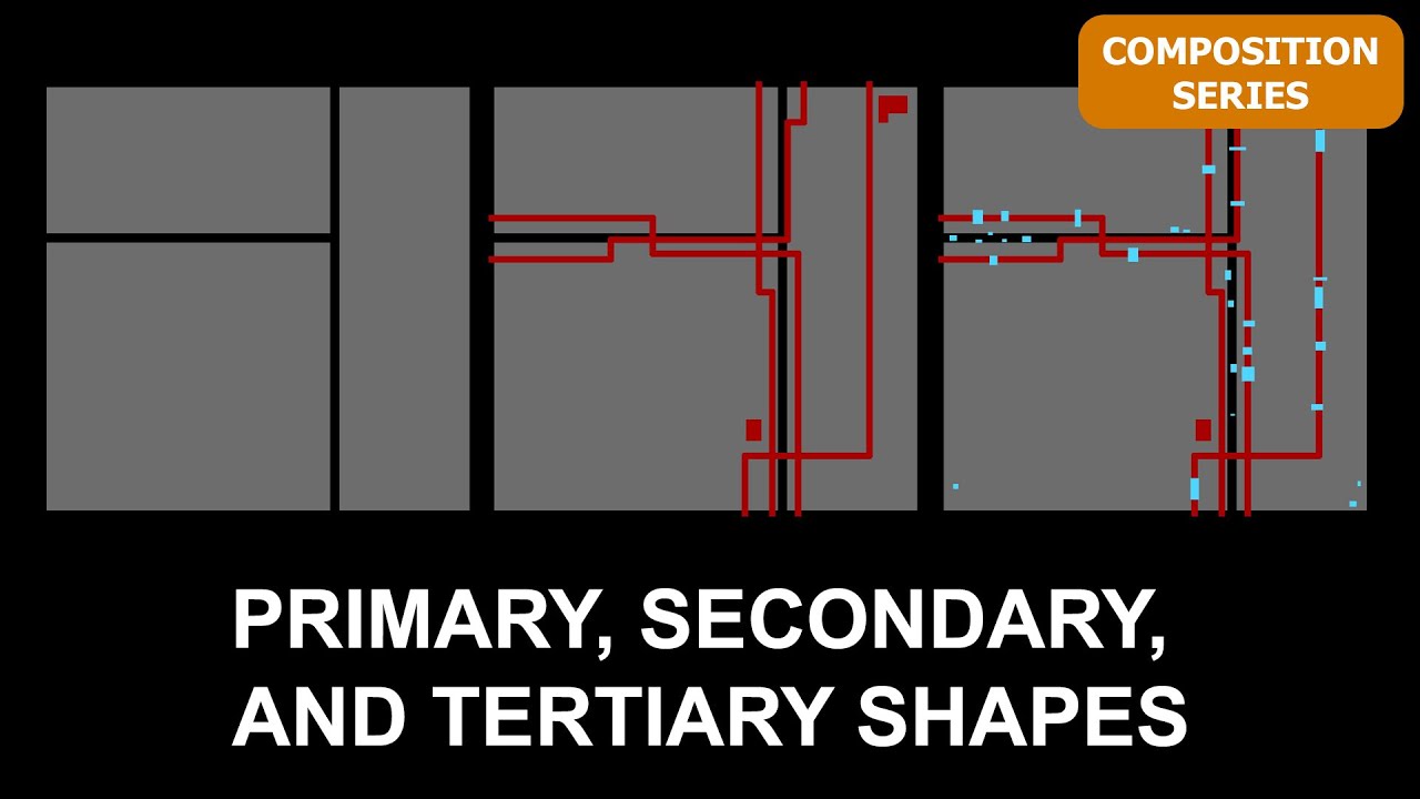
There’s a very useful visual design principle, called big-medium-small. It posits that appealing designs/compositions always consist of a balanced distribution of big, medium and small shapes (or forms in 3d), establishing a strong visual hierarchy. This is a particularly good guiding principle in character design.
You may want to look it up and try to apply some of it your design process: