Starting to work on a new layout for the loot UI, using buttons as requested. Thing is that I don’t know where to include hotkeys now, and I find the buttons annoying myself.
2 Likes
v3.1.0 is here. This is a prototype version to address some concerns and QOL features.
- Hotkeys still exist, but text doesn’t mention them. Buttons are used instead to reroll and take/scrap loot.
- You can now zoom in or out with scroll wheel
- Enemy evolution is now controlled based on the actual wave as well as the overtime mult. This means certain enemies that use exponential scaling (legman, blob, agent) will not use it until the wave has passed 20 (not just wave times overtime.)
Soon:
- Minimap
- Balancing
- Healthbar issue fix
- Integrating the shop feature (it’s half-baked)
- Audio clipping issue
- Improving UI of the deck menu
Eventually:
- Final polishing before submission to small content creators
- Gather feedback and ideas for new content
- Implement, then submit to larger creators
3 Likes
I’d expect +1 combo slot to mean +1 combo slot. You could add “doesn’t use a combo slot”, but that wouldn’t work in cases where the player has 0 free slots.
I listened to the tracks on the artist’s BeatStars page, the one you have a link for in the credits. The mixes there are nice and even, the one you just linked to sounds louder (bass in particular) but not clipping (crunchy high-frequency noise).
I agree that the two examples you’ve picked are not very prominent, and I would have offered the same advice to their teams as to you. By complete happenstance I’m sure, the health bar in Hades 2 is about 400% larger than in 1… no real reason I’m sure.
Your game doesn’t have a health bar, it has numbers. Numbers are not as quick to read as a bar.
I don’t think so, or at least I haven’t found many exploitative combos. Getting extra combo slots could be curtailed somewhat, since combo cards don’t scale in price, making them very quick to build up. Scaling up combo card costs (like with shops) would also seem to make sense.
That said, I do enjoy when a build runs wild. Those are the times I’ve laughed out loud at the sheer volume of bullets filling the screen ![]()
I think the scroll wheel solution sounds good. Just to be clear (again), I assume you mean “the player’s” liking, not mine specifically. I’m not making requests, only observations.
I may not reply to discussions of those observations in the future. I only have so much time to spend on the forums, and I think it’s better spent testing games… you make the decisions ![]()
1 Like
Awesome work as usual!
Pretty much nodding my head and liking everything. Are you looking at submitting to any festivals or anything like that?
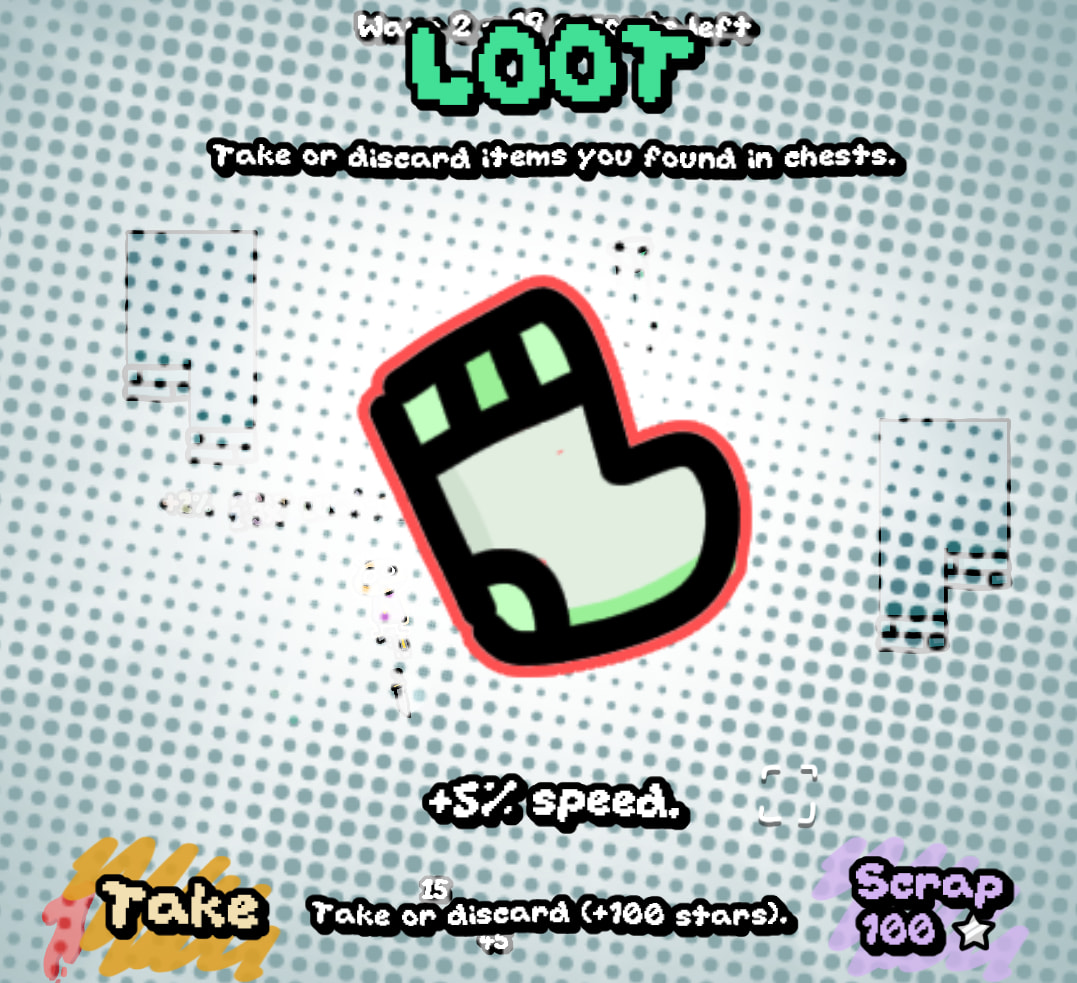
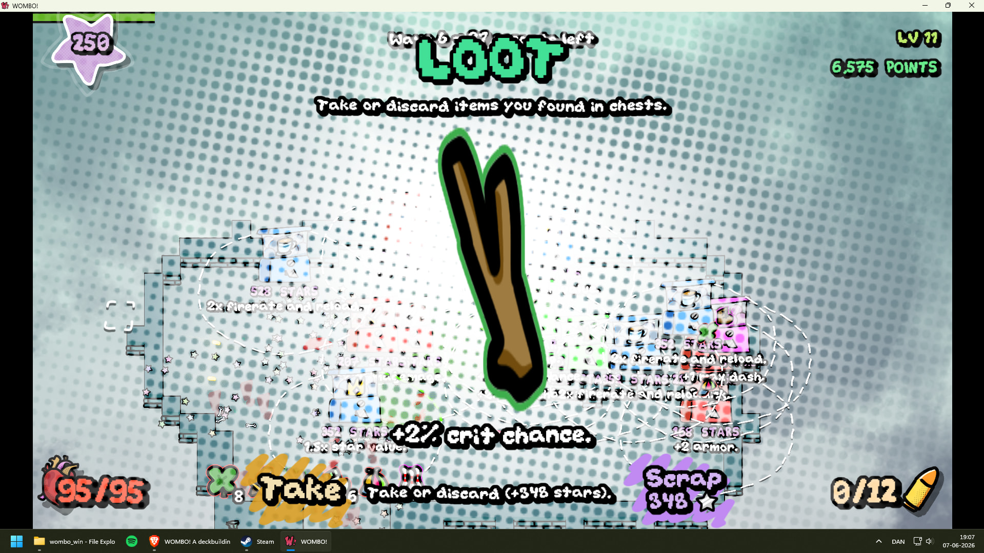
Only thing I can suggest rn is you could visually differentiate powerups, cards, level up cards and loot a bit more intentionally for the player.
Its been a minute since Ive played a build, but it feels a little overwhelming and confusing.
Small visual tweaks could totally fix it. Maybe the temporary items could have a stopwatch or hourglass icon somewhere on them. Permanent items could have an infinity symbol, or I guess you could leave them as is and the player would get that they’re not temporary.
Are the level up cards permanent? You could change the design slightly by making the card look double-layered or triple layered; and they could have a coloured rim or border so they look a bit more premium. That way you’d know it isn’t a throw away thing, but actually a permanent addition to your arsenal. Nice little dopamine hit for the player.
Sorry if this just sounds like a rant. Everything else is actually super amazing.
Been an OG fan!
1 Like
Summary
Sort of. I’m looking at a different approach to get eyes on the game. First, I’ll enter a few small feedback events (festivals as you call them). Then, reach out to small YouTubers. Finally, larger and larger YouTubers, collecting feedback and new content along the way.
I could make new card art to separate level up cards from combo (normal) cards.
There’s really just two main things here; loot and cards. The addition of level-up rewards is probably the confusion factor, given it uses the same art.
There’s just powerups, and those are bright green. Perhaps I should change the color to rainbow. Rainbow text already denotes items you pick up in the wave that you don’t immediately equip (sent to a menu to decide on).
Not at all, feedback like this is tremendously useful. If you have more feedback or issues, feel free to share them, even the most minor nitpick.
1 Like
I’m back after a brief vacation.
What’s new:
- New system allows for cards with complex effects (e.g. 2x damage to stunned enemies)
- Fixed replication of trees and bushes in MP
- Fixed audio clipping issue (a line of code was setting dB to high levels)
I’m aware of an issue where the game freezes at random times. I don’t know what the issue is, because I don’t get any output errors. Will look into it.
Soon:
- Fixing aforementioned issue
- Tweaks as requested by Zeb to effectively convey information
- Tweaks from Phoenix; same thing
- Nerfing +bullet, +ammo, +fire-rate cards so the “spam build” isn’t as viable
- New cards using the new framework, more interesting interactions
Eventually:
- Launch early access / demo on Itch and promote it
- Work on a side project (?)
- Flesh out with more content
- Release on Steam
4 Likes
I managed to find and fix the aforementioned issue. Released v3.2.1
2 Likes
No more clipping! I know it’s probably just a single float, but it makes a big difference to my enjoyment ![]()
-
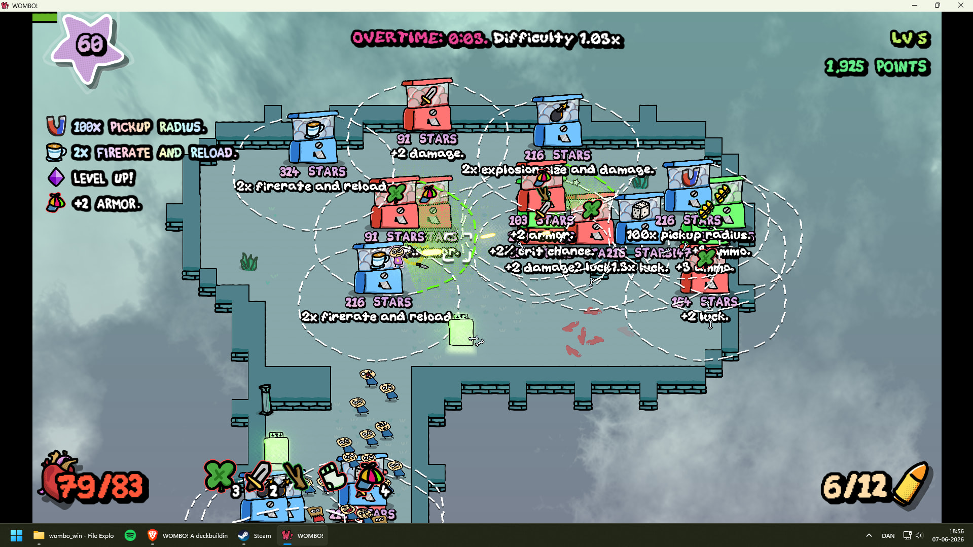
I spawned in a very small level, piled with shops. Strange:
-
Aiming seems to be mouse only… wasn’t it auto-aiming before?
-
Some items seem to display oddly here:
-
Combo card selection still needs a bit of work I think - would be nice with clickable buttons there too. Also some (more) visual representation of the card “library”, so it’s clear that there is one even when it’s closed. Also a “finish” button.
I’m not sure, but I think it may work best with both the library and the available slots visible. I seem to recall that combo card order is important, so drag-and-drop would be nice.- I couldn’t get Z/X to work for reordering, or B for delete (which should maybe called “remove”) - simultaneously hovered over, clicked, tried everything I could think of.
-
Another detail - the stats to the right in the shop screen should have <-clickable-> buttons. It’s easy to miss that there are several pages.
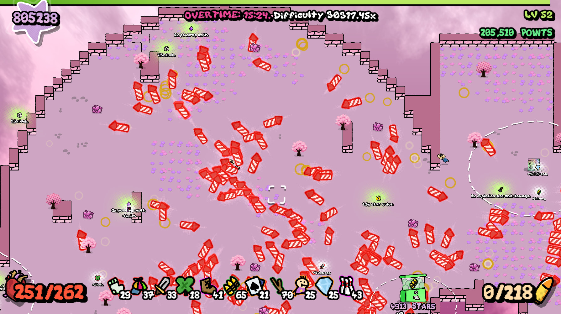
I played the small map and got what I think is my personal best: 965 billion or so unspent stars ![]() I got to a point where I could just leave the game alone, i think because of high armor and dodge (and huge damage of course) - they may need tweaking at later levels. I recorded a video of the last half of the run, since my previous video didn’t show a succesful run, but I didn’t remember to record it from the start. Maybe you can glean something of value from it anyway.
I got to a point where I could just leave the game alone, i think because of high armor and dodge (and huge damage of course) - they may need tweaking at later levels. I recorded a video of the last half of the run, since my previous video didn’t show a succesful run, but I didn’t remember to record it from the start. Maybe you can glean something of value from it anyway.
That video is helpful indeed. I’ll fix the issues mentioned ASAP, then add some new content I have planned.
Fixed.
Perhaps you accidentally clicked Ctrl? That toggles auto-aim.
Fixed, I think. Couldn’t repro issue myself but I took a guess at the cause.
Will work on it.
Will work on it.
I disagree, most of the strategy is in rearranging cards than picking different ones, at least right now when combo slots are so easy to get.
Fixed. Click on a card to select it.
Done.
Agreed, the first thing to adjust is crazy damage multiplier cards like Tractor Beam or Cannon.
I’ll update soon with these changes and a handful of new cards.
1 Like
OK, v3.2.2 is here.
Changes:
- Bug fixes
- UI fixes
- Removed +1 hand size item since hands no longer exist (the ace now gives +5% loot drop chance)
- Map generation fixed and reworked for more interesting maps (slightly smaller too)
- Nerfed Extra Mag, Greatsword, Mjolnir (multiplier-based cards get too OP)
- Reworked Nailgun (+30 damage to enemies, -20 damage to bosses)
- Fixed bug in shop discount, effectively nerfing Expired Coupon and Joker
- You can now click to focus cards, then use Z/X/B
- Overtime multiplier and enemy scaling have been massively increased
Soon:
- Better deck menu UI
- More nerfs, balancing, and new cards
- New loot
- Fully clickable UI
Eventually:
Tweaks as requested by Zeb to effectively convey information
Nerfing +bullet, +ammo, +fire-rate cards so the “spam build” isn’t as viable
Launch early access / demo on Itch and promote it
Flesh out with more content
Release on Steam
Are the new maps better, or should they be rolled back?
3 Likes
No major bugs this time, though the combo card select screen is still very rough. I didn’t get the controls to work most of the time, and having one overlaid the other seems needlessly confusing. Cards that are hovered over don’t come to the front, and clicking to see sends a card to the other screen. Thankfully I found that arrow keys navigate the cards, which isn’t communicated, but as far as I can tell there is no keyboard key to select cards - enter obviously ends the session.
Maybe it would be good to check with other people what they think. You seem confident that the system works, so I won’t spend more time commenting on it in the future.
-
Needs a cap on zoom in / out.
-
Not sure about the new overtime multiplier’s / enemy scaling effect, I didn’t notice a difference. At some point enemies seemed to stop spawning, after about 1000x difficulty. It could just be that I was killing them off-screen. I let it run until 30000x difficulty.
-
I noticed a new kind of super-slow-motion, but the character was consistently off screen, so I’m unsure what it means.
-
Does pickup radius include all powerups, or only stars, and why? It can actually be pretty finicky to pick up a powerup as the character’s speed goes up.
-
In the CCard menu I was sometimes able to “delete” cards, sometimes not. No identifiable pattern. Both Z and X seem to move the card to the left.
-
Since combo cards are freely selectable, rerolling cards should not cost more than the most expensive card on display - buying one is the same as a reroll, but with an added free card.
-
There is still invincible, target-stealing, bullet-blocking foliage around (at least with explosive bullets)
-
Would be good to indicate that combo card order matters. Also how they relate to base powerups (I believe something like +max ammo comes before combo cards for instance, so a cap on the CCard makes those powerups redundant). A little Label like “combo cards are applied after basic powerups, in this order ->” might be enough.
- Come to think of it, combo cards generally have a lot blank space, seemingly for no reason - if you made them smaller / shorter, you’d have a lot more room for them on the combo card select / library.
-
If manual aim is an intended feature, it should be communicated to the player how to activate/deactivate it. Also, it would be good to have an aim line from the character when aiming manually, the “crosshair” can easily get lost on screen. That would also indicate which mode the player is in.
Lot of helpful feedback once again!
Summary
I agree. I may have to switch to a drag-and-drop, but I’ve always hated such interfaces. The current system isn’t exactly intuitive either. I’ll think about it more.
OK.
I have a feeling there’s a bug with difficulty scaling… At this level enemies should be totally unkillable.
When the one-shot protection kicks in (you take a fatal hit), you take reduced damage (max half of your HP) and time slows for 5 seconds along with a sound (clock ticking). This should force the camera toward the player, though. I’ll investigate.
I can make this change, but I thought it would end up being annoying to accidentally pick up powerups in the wrong order or when they’re unwanted.
I’ll rework things.
Indeed, now it is. It used to not be the case because of having a more bloated deck for the hand system.
Will fix
This is mentioned in the tutorial, but I can also find some space for it on the build menu.
That’s true, but I’m rather attached to their shape. Maybe slightly smaller could work.
It’s useful in very rare occasions, but on the whole I’d say I could just remove it.
I went to play a run, and I now understand both major issues. Overtime had “no enemies” because they would get so fast from the overtime multiplier that they couldn’t even reach you and would start bouncing around the map furiously. The card menu begins to suck after getting more than 20 cards because the screen is fully covered in them, and they don’t focus properly. I’ll fix these two today.
For some reason, bugs always seem to crop up towards end of a project ![]() Hang in there, you’re making a lot of progress, and there’s bound to be a little chaos.
Hang in there, you’re making a lot of progress, and there’s bound to be a little chaos.
You could do click (maybe right click) to remove and click to place in the earliest available slot, maybe in addition to dragging? I’m sure there are ways around dragging entirely, I just happen to like the “physical” feel of it ![]()
I’ve thought about that as I’ve played, and I have yet to come across an unwanted powerup. Also, I was unaware that pickups are dependent on order. Could you give an example of both? I’m sure there’s something I’m not getting.
You could retain the same aspect ratio and just make them smaller? The text is quite large enough for regular screen (I forget if you’re going to build for mobile / tablet), so you could auto-shrink it a little for cards with a lot of text, if necessary.
Once the indestructible-plants-steal-aim thing is fixed, I think it’s still nice to have as a player, to snipe dangerous enemies from afar or ignore a swarm of nearby minor enemies, but not essential
Summary
Sure. Unwanted powerup: picking up a powerup at the wrong time (firerate when no nearby enemies, magnet when no stars, star value when no magnet)
Order: 2x powerup mult should always be before other powerups. I might just remove the 2x powerup mult item. It’s just too nonsensically OP with star value, allowing for 950 billion stars like you got.
Sounds good. Wouldn’t it get annoying to have too many cards on screen though? It’s already a nightmare to sift through a screen full of cards, but that’s mostly the fault of the deck UI.
I think I’ll just remove it.
Ah, I wasn’t thinking of the temporary ones. I’d say that’s acceptable as a potential drawback of high pickup radius, the only reason I think it’s relevant is that it’s tricky to get pickups with a high speed… maybe they just need a small overall increase in radius? As always, it’s up to you ![]()
There is definitely a balance. Maybe you could scale cards dynamically, just to see what will fit? If you’re using a FlowContainer for cards, you may only need to set their scale as they’re instantiated.
I’ve added all unfinished requests to a list. Have I missed any?
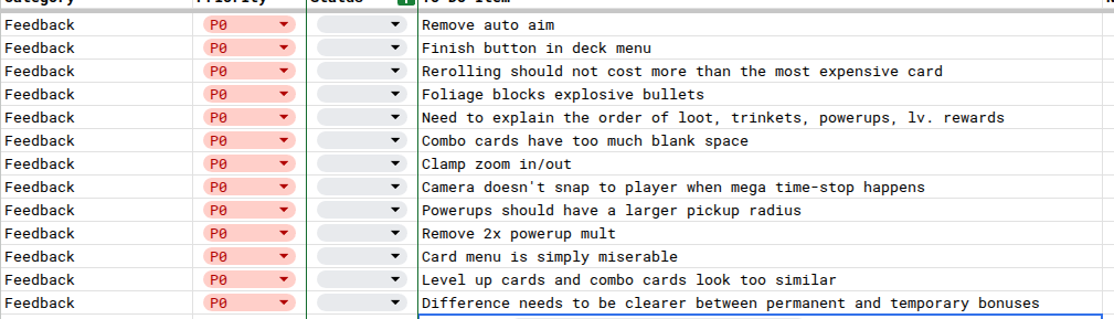
Edit: typo. remove auto aim should say “remove manual aim”
1 Like
I’m thinking of adding a bit of extra text and an image to fill out the combo cards.
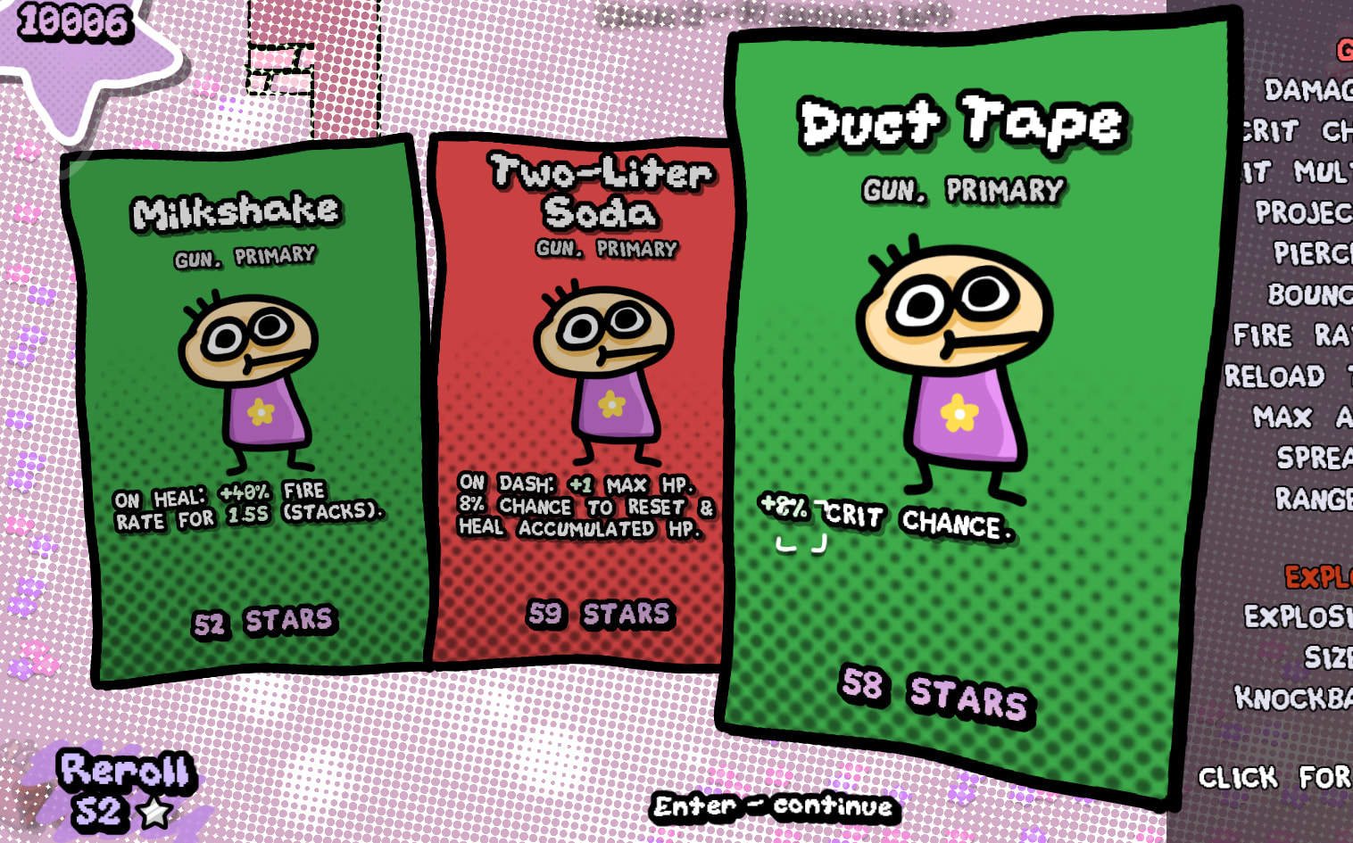
This is a mockup - any good?
2 Likes
I like the look, the card layout seems to make a lot more sense now. I don’t see a need to fill the space, when you could just not have it, but I do think (as I remarked at some point) that having (their own) illustrations or something similar would make them easier to tell apart.