I’m new to UI so I apologize if my questions are somewhat basic/obvious.
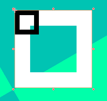
I’m having trouble figuring out how the Icons & Styles under the Themes Overrides sections for CheckBox nodes work. The icons are fairly straightforward, but I have no idea how the styles interact with the icons. First, for some reason the styles (white in the image) show up way bigger than the icons (black in the image)—how can I resolve this? Second, there are only 1 Normal, Pressed, Hover, Hover Pressed, and Focus options, not 2 for both the checked and unchecked box. Do the Normal & Pressed Style texture not overlap with the Unchecked & Checked Icons textures? And how do the Hover, Hover Pressed, & Focus options work alongside the icons?
No need to apologize, when you use a new software you need time to learn it, and this forum is one of the places for asking questions.
I recommend that you create a Theme. In the first Control node (green) of your scene-tree, add a theme. This will add a panel on the bottom of the screen.
There you add styles for each of the Controls, which are reused by every Control of that type, or you can create theme_type_variations to make it different, like a special red button.
A theme will save you time by altering the style of all the Control nodes, and will also show you what styles each Control has.
You can also see the styles in the documentation.
Check is a Button. When a button is pressed, it uses the pressed StyleBox, and when unpressed it uses the Normal. This covers the entire size of the Control node and can adapt to the surroundings, like expand in a BoxContainer or be set to an anchoring.
But Checks are special because they have an additional element, icons. Icons are drawn on top of the styleboxes. And Icons are always drawn at the same size. This is because when the button is resized, say, horizontally, it needs to fit both the text and the check icon.
Try using bigger Icons, or setting limits to your styleboxtexture. By default it expands to cover the entire area, but you can set limits in the StyleBoxTexture settings.
This depends on how the button will be used. I don’t use checks often, so I can’t speak on this, but usually you would need one for unchecked, one for checked, and disabled versions of these, so like 4 images.