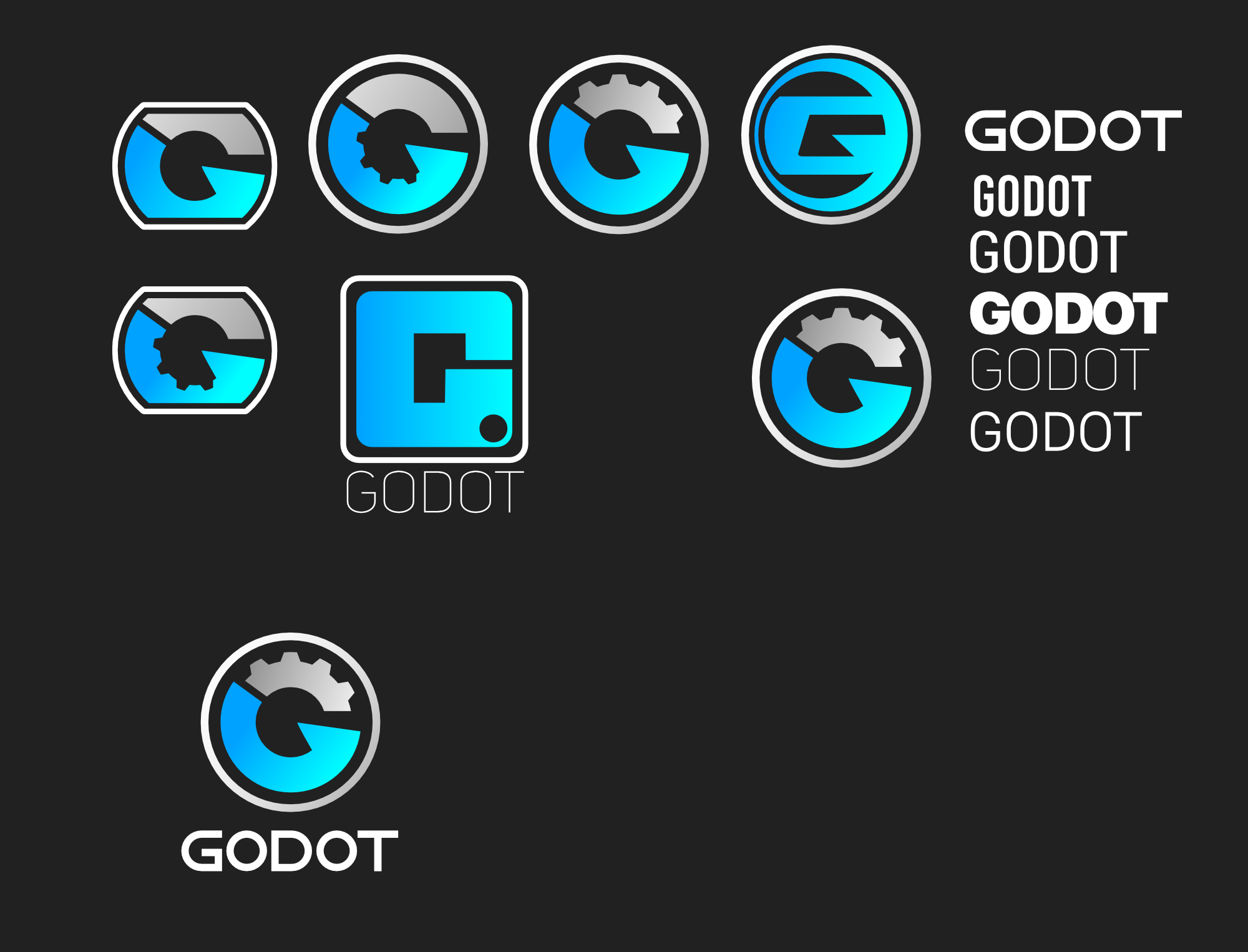
I have thoroughly enjoyed using this program, and maybe this is a little controversial, however I feel like the logo is not a fair representation of the program. I think it gives the software a bit of an 'amatuer’ feel and I think it would turn away new users. In my opinion it needs an upgrade - because the software and what it stands for is really good - and I think we need to get more people using it!
While I’m not the biggest fan of the current logo and I do enjoy seeing alternatives, it is distinctive.
Though my initial reaction to yours is that Godot is some sort of eSports team.
18 Likes
These logos are a bit like logo of game maker engine🗿
3 Likes
Thanks for the feedback. I don’t know what their logo is but I’ll check it out!
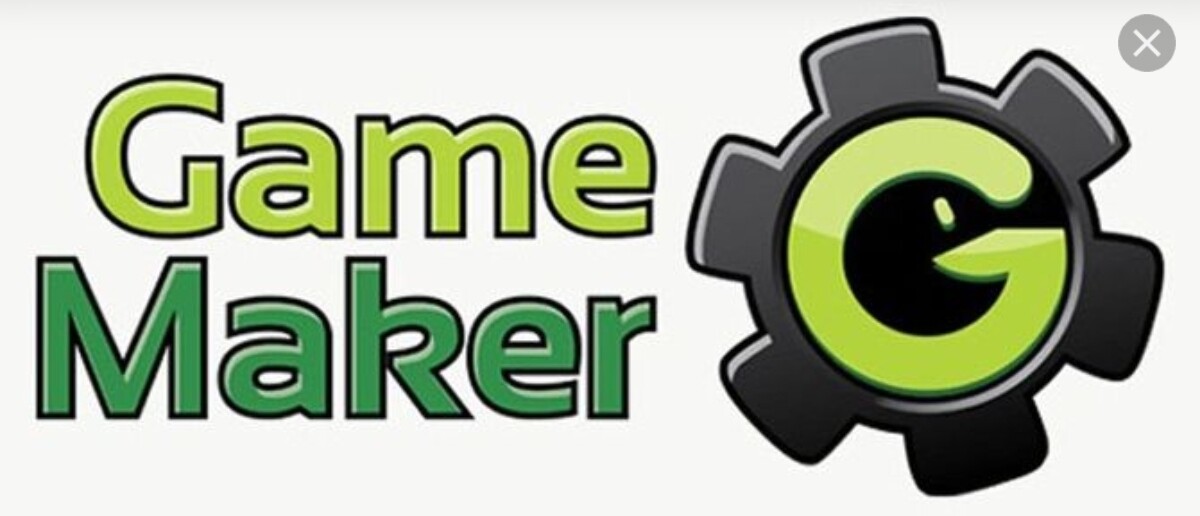
Yeah ok. Interesting they both use Cogs in their designs.
I like the current logo. It gives a unique feel and I think it perfectly represents it’s open source and community based game engine approach. It doesn’t need to be like other engines.
11 Likes
No, it doesn’t need to be like other engines but I think it could better reflect the quality of the software ![]()
3 Likes
Your logos look nice, but it seems like Godot has no desire to update the logo:
That issue is over 5 years old ![]() , but here is a newer issue, that says similar:
, but here is a newer issue, that says similar:
Just letting you know, as although its cool people are inspired to create new logos/icons, I think your time & expertise is better spent elsewhere!
5 Likes
I really like this one
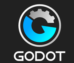
But I think the Godot logo fits the engine pretty well.
It doesn’t look very professional, somewhat playful and immature, and simple.
And the hair and teeth look like cogs. Right now I find the logo appropiate. And most importantly easy to recognize.
And strangely I grew to love it!
5 Likes

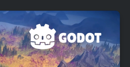
I don’t mind the logo and monochrome renditions make it look like a skeleton. It’s also a nice mascot, opposed to a letter that can cut you which isn’t really unique. (Eyes glance at Unreal engine)
Just look how fun it is in the official posts.
6 Likes
Thanks for the feedback ![]()
Haha yeah the community seems pretty attached to it. That’s all good.
2 Likes
Ha interesting you say it doesn’t look professional etc yet you still love it.
There’s definitely a community attachment to it. It’s a great product for sure!
1 Like
I would love this logo just that the light shades of blue are a little vibrant maybe turn that down a little bit.
1 Like
IMO one thing is often overlooked besides recognizability: adaptability.
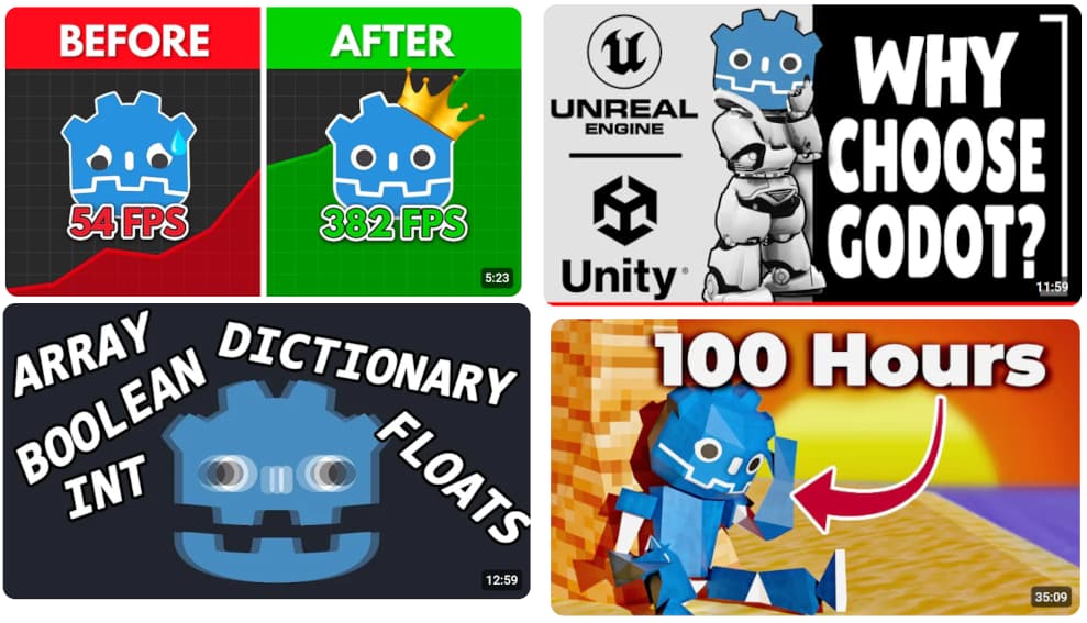
I have never ever seen a logo being adapted and used in so many places before. Just take the Godot plushie, it’s basically a plushie adaption of the logo. Or take a look around on YouTube, how many versions and adaptions of the Godot logo are in thumbnails there, sometimes being pretty funny.
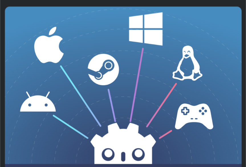
The other major engines have strict branding guidelines disallowing such use. The Godot robot on the other hand is well known and used in so many places at this point, it would be insane to let it go.
15 Likes
This is exactly my point. Godot logo has a unique appeal, it has a sort of personality now.
3 Likes
Thanks for the feedback.
It’s great there’s a such a passionate community behind godot. But again these pics make it look amateurish.
It doesn’t reflect the quality of the program . The reason companies have brand standards is to ensure their brand is reputable and well represented.
I was literally just watching a video tutorial on something and the guy was like ‘don’t use the godot icon, it’s ugly’ I had to laugh.
But also it’s great that people are passionate about the current logo too ![]()
I love this icon and I want to use it as an avatar for this website, is that possible? Thank you
2 Likes
You can use it ![]()
2 Likes