Thank you so much
It looks great! But I think there’s something homey, and comforting about the current icon that will never be replaced by a sleek new icon, there’s something in that derpy face that’s just too loveable.
This one is really clever! Great design idea.

However, there is something about that Godot face we currently have. The flat mouth really speaks to me about the frustrations of game design!
Paul.
PS If you were going to refresh the logo, a complete abandonment of the current logo would be a bad idea IMHO. It may benefit from some polishing, but nothing too radical.
Of course, one that makes me laugh is this one, especially because the YouTuber talks very fast when the videos start XD

Haha yeah for me it’s a love hate relationship ![]()
Hmmm maybe an upgrade to the current one rather than a complete new one… could be a fun idea!
I’m curious, why do you think the current logo looks ‘amateurish’? I think it’s a very versatile, cute, and recognisable logo that does a good job of conveying the ‘vibe’ of Godot. More than that, it’s easy to draw and stands out against the logos of the current competing game engines, which I find to be a bit bland and soulless.
Hmmm I think it’s a little too simple. It gives the impression that godot is not a serious game engine. And I disagree. I think it’s a very capable game engine and I think the logo should reflect where Godot is at nowadays. I was personally hesitant to jump onto Godot because I thought it wasn’t really something to be taken seriously yet. It was just a ‘fun’ tool. But I think it’s come a long way now and in my opinion the logo could do with a refresh.
I’m also seeing this across multiple Godot YouTubers who say the same thing. That it’s an ugly icon / logo.
Both sides seem to have legitimate concerns that I think could be compatible with each other. Surely if given proper creative time and space, some good designers can come up with a logo that’s (1) more sleek and professional to establish a more universally accepted branding, while at the same time being (2) true to the current logo to maintain strong ties with the mascot you’ve known and loved. Remember, our unfiltered response to change is probably more adverse than is warranted!
Also loved some other person’s reply about having variants/different renditions. It convinced me that you can adapt the current logo to serve different tones/atmospheres, and that the question of how “serious” the default tone should be can be a good topic of discussion here.
Open source logos tend to be a little funky ![]()
- Linux
- GNU is a crazy one
- PHP
- GIMP
- Blender
I think it fits just fine
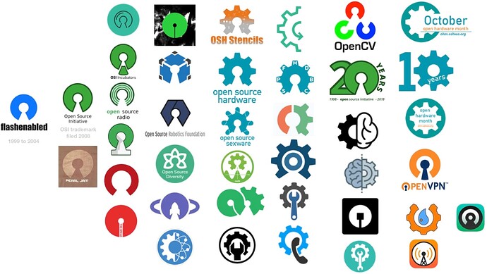
Out of curiosity I looked it up. Someone actually collected wheel and keyhole logos. The one in the center is interesting.
Personally I like them all.
But to put things in perspective, the difference between the logos for unity and unreal makes Unity look on par with godot.
Just saying.
Every month or so there is someone saying the logo should be redesigned and I agree that Unity and Unreal look more “professional”. However, let me share my experience with it so far:
I’ve been part of the booth staff at GDC 2023, and Brazil’s BIG Festival/Gamescom Latam in 2023 and 2024. The pins with the Godot logo were one of the most sought after pieces of swag in all of those cons.
Even people who knew nothing about Godot came looking for a pin and asked what it was about.
At GDC in particular it was surrounded buy a bunch of abstract white shapes on black background and it really stood out.
Each logo has to transmit something, not just look cool and follow trends.
Unreal was an FPS from the 90s. It’s logo looked like a logo for a heavy metal band, not unlike every logo for every 90s FPS targeting edgy teens. Now they can do whatever they want with the logo because everyone knows what Unreal Engine is.
Unity was originally Unity3D and it’s logo was three arrows which contained a 3D box in negative space. Being a really cool 3D engine that a regular person could get access to was a really big deal at the time when the offer of similar tools was extremely limited.
Now when it comes to Godot, having a cute mascot rather than an abstract logo is not only part of a shared tradition among open source projects but also something that transmits the idea of friendliness. Godot focuses on usability, it tries to be a user-friendly engine with a friendly community.
So overall I think that even though people might find that it doesn’t look pro enough, it is certainly more fitting than a hyper minimalistic or abstract logo like what people propose every now and then.
you Absolutely NAILED IT !
Good job friend !
I can’t unsee the Tetris block in this one. Pass for me of it connects with another IP.
I actually don’t mind the blue robot, i think it looks fine. It’s cute, it’s personal. It’s art. Your logo designs by comparison are quite cold and impersonal, so I prefer the robot.
Some great insights thanks.
But if that’s happening every month or so then maybe that’s something to think about…
Interesting the community has a lot of attachment to the mascot-which is cool, but also probably that’s the kind of audience Godot currently has and I think for first impressions it’s putting a lot of other people off the program.
There was a great opportunity recently with Godot getting some more of the attention due to the recent Unity pricing issues, but watching the online videos around this, many were apprehensive to switch to Godot because they thought it wasn’t up to the task. And I think the logo is aiding to that first impression.
I don’t think people really care much about the logo, it’s such a minor detail. Don’t get me wrong, it matters, but the logo couldn’t have been further from my mind when i was deciding to use godot.
I don’t think the mascot logo gives an amateur feel to it, honestly i never gave this any thought until your post, i’m not particularly attached to it, but the mascot logo is actually a fantastic design.
It’s a face, people identify with faces, people remember faces easier than generic logos, it’s genius in a way.
I like it as it is, I’ve seen other projects go for more “professional” branding and it just seems to take the personality away a bit for me, makes it more corporate and dull. Like when a fork of the art package GIMP was made because that name didn’t seem “professional” and the LMMS logo change I never really liked either. Your designs are good though.
I like the ideas - keeping the gear shape and the blue and gray colors, but I feel like it should still retain that blocky feeling from the original robot logo. The sharp point in the G feels too sleek, unalike Godot’s vibe. Additionally, I personally prefer the muted blue that the OG chose. While it certainly doesn’t pop, it’s unique and echoes Godot’s simple style. But overall, these are amazing!! I also like the designs for the name. It’s all good!!!
