A common way this is done in interactive UI that uses CSS (or similar) is to use an inner container – just a nested container. By “container” I don’t mean an actual Container node; just a Control node that contains content. For example:
Panel(root)Panel(nested container)- …insert your design here
With this setup, you are free to adjust the styling of your card since the HBoxContainer is using the root of your card to control its size.
There’s a few extra settings you need to configure to get your effect to work properly though. For one, the pivot point of the inner container must be shifted to the center in order for the card to not scale to one side. However, you can’t set this directly in your layout since the card’s size – and thus the inner container’s – is modified by the HBoxContainer. Therefore, you have to center the pivot point at runtime; I didn’t find a way to position the pivot with percentages.
The other setting is configuring the nested container’s Layout Mode to Anchors and then setting the Anchors Preset to Full Rect to make it fill out the root. This will make it follow the size of the root.
Below is my attempt at a simple implementation.
extends Control

@export var center_pivot = true
var scale_tween: Tween

func _ready():
	# Connect signals
	mouse_entered.connect(_on_mouse_enter)
	mouse_exited.connect(_on_mouse_exit)

func _on_mouse_enter():
	# Clear current animation
	if scale_tween:
		scale_tween.kill()

	# Center the pivot
	if (center_pivot):
		pivot_offset = Vector2(size.x / 2, size.y / 2)

	scale_tween = create_tween()
	scale_tween.tween_property(self, "scale", Vector2.ONE * 1.02, 0.2)

func _on_mouse_exit():
	# Clear current animation
	if scale_tween:
		scale_tween.kill()

	# Center the pivot
	if (center_pivot):
		pivot_offset = Vector2(size.x / 2, size.y / 2)

	scale_tween = create_tween()
	scale_tween.tween_property(self, "scale", Vector2.ONE, 0.1)
The script above is placed on the inner container.
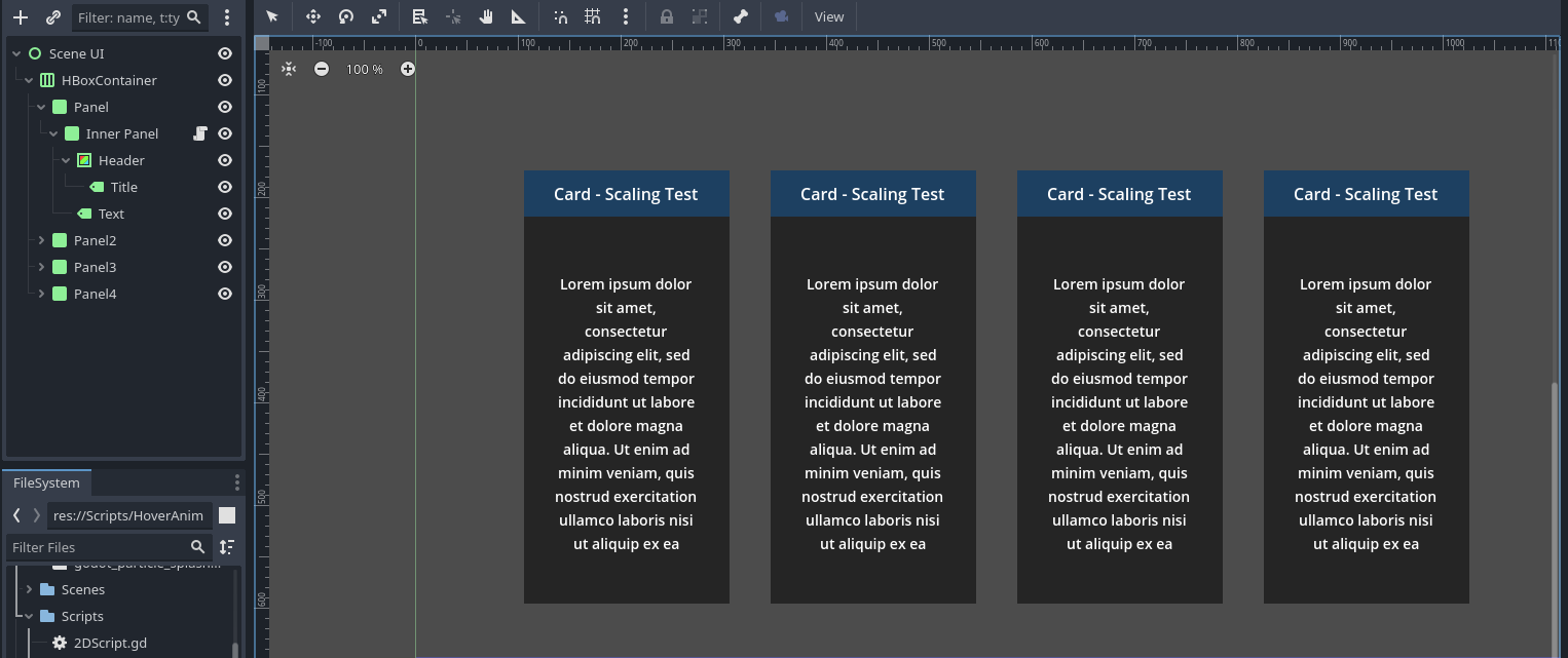
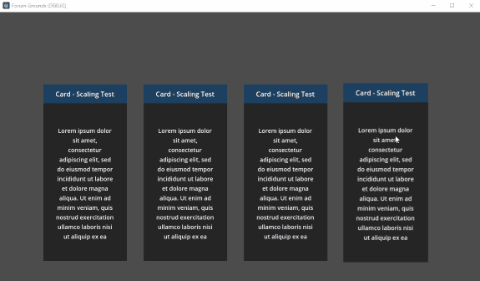
The scene setup for the implementation – and the scene at runtime.