This is my demo/tutorial/reference to create a simple drop down menu. I found the default menu options did not provide the look and feel I wanted so I created my own.
Here is a visual demo to showcase the menu in action:
So as you can see, it’s fairly simple but works nicely. To get this working I had to fiddle around with options and experiment for a while, so now hopefully you can read this and not have to do all that.
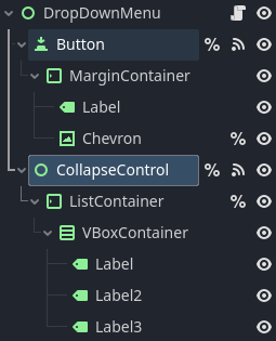
Here is the node tree for the drop down menu:
And here is the script for the menu:
extends Control

@onready var button: Button = %Button
@onready var chevron: TextureRect = %Chevron
@onready var collapse_control: Control = %CollapseControl
@onready var list_container: MarginContainer = %ListContainer


var expanded: bool = false


func _ready() -> void:
	chevron.pivot_offset = chevron.size / 2
	custom_minimum_size.y = button.size.y
	call_deferred("reset_panel")


func reset_panel():
	collapse_control.size.y = 0


func _update_chevron(expanded: bool):
	var target_angle = -180 if expanded else 0
	var tween = create_tween()
	tween.tween_property(chevron, "rotation_degrees", target_angle, 0.25)


func _on_button_toggled(toggled_on: bool) -> void:
	_update_chevron(toggled_on)

	if !toggled_on:
		var tween = create_tween()
		tween.tween_property(collapse_control, "custom_minimum_size:y", 0, 0.25)
	else:
		var tween = create_tween()
		tween.tween_property(collapse_control, "custom_minimum_size:y", list_container.size.y, 0.25)


func _on_panel_container_minimum_size_changed() -> void:
			custom_minimum_size = collapse_control.get_combined_minimum_size() + button.size
There are a few important things to note here that help understanding how this all works so I’ll try my best to describe everything in a clear way. Keep in mind I am by no means an expert in GDScript or Godot’s UI systems so a lot of this might be inefficient or wrong. With that being said let’s get into it.
Control Nodes
The first thing to note is the two Control nodes ‘DropDownMenu’ and ‘CollapseControl’. The reason these nodes are Control nodes is because you can freely manipulate their size directly, unlike normal Container nodes. This is critical for ‘CollapseControl’, but ‘DropDownMenu’ you could probably change to a VBoxContainer or something else and it would still work. Also maybe it won’t, feel free to test it. I’m too lazy to.
If you leave ‘DropDownMenu’ as a control node, you must manually place ‘CollapseControl’ where you want it to be. It may be worthwhile here to use the script to set the position dynamically so it sits right below the button, I’ve just manually set it here.
Clip Contents must be turned on for ‘CollapseControl’, this is the method that hides the drop down menu options.
‘DropDownMenu’ under the Layout → Container Sizing → Vertical must be set to Shrink Begin with expand disabled. This is what allows the menus to alter their positions to sit snugly against any menus above them, and reposition as needed.
Other Node Settings
I have ‘ListContainer’ → Layout → Anchors Preset set to Top Wide. This is so it sits below the button, and will automatically resize itself as needed.
I have ‘Button’ Toggle Mode set on. Layout → Anchors Preset set o Top Wide.
My ‘Label’ and ‘Chevron’ nodes for the ‘Button’ are both set to vertical align center. The ‘Chevron’ node does this via Container Sizing → Horizontal set to Shrink End and Vertical set to Shrink Center
Script Explanation
The ready method sets the ‘Chevron’ pivot_offest variable to the middle of the texture. You could do this manually in the node Inspector, but I’ve done it in the script and it should handle textures of varying sizes this way as well.
The rest of the ready function is just for ensuring initial values all make sense and don’t accidentally mess things up. It may be worthwhile here to make this a @tool script and have these values set in the Inspector automatically.
_update_chevron simply animates the chevron icon to spin around when you click it.
The main thing to note is the _on_button_toggled method. I invert the toggled_on value since in this menu the menu’s start position is closed/collapsed. If you wanted an open menu by default you would need to swap this around the other way.
The rest of the method is just setting the custom_minimum_size properties, but that isn’t enough to have the menus reposition when there are multiple of them in the scene. That repositioning relies entirely on the minimum_size of the ‘DropDownMenu’ node. Normally, Container nodes adjust their minimum_size to fit whatever their contents are, Control nodes do not do this. So we have to use a signal to update the custom_minimum_size on ‘DropDownMenu’ in parity with the ‘CollapseControl’ node. Side note: changing ‘DropDownMenu’ to a VBoxContainer may do this automatically without needing any kind of signaling or minimum_size updates.
Note you have to use get_combined_minimum_size here, Control nodes will always return a (0,0) since internally they do not adjust their minimum_size based on children. Using the combined method it returns that internal value plus the custom_minimum_size one.
Ending Notes
Well that was a lot more ramble-y than I intended. Oh well. I hope this helps someone out there. And if anyone has any simpler or better ways to achieve this type of menu effect, leave it in the comments/replies please.